
- First Steps Checklist
-
Frequently Asked Questions

-
All About Features
- How to Install the Tracking Code
-
User Guides
-
Integrating With Other Platforms
-
Legal, Data Privacy & Certificates
- TWAIA Addendum
- White Label Analytics
- Glossary
- Contact
Main Dashboards
All You Need to Know at a Glance
- One Glance to See It All
- Set the Date
- Some General Hints
- Dashboard Feature Tour
- Filters for Enhanced Dashboard Control
- Data Visualization Options
- Download Your Data
- Master Dashboard
- Website Usability
- Page Views, Sessions & Visitors
- Page Views Overall on the Top 6 Pages
- Bounce Rate
- Top Visiting Countries
- Live Visitors Map (Uniques)
- Visitor Sessions Overview
- Top Landing Pages
- Top Forwarding Referrers
- Top Pages by Sessions
- Top Operating Systems
- Most Used Browsers
- Top Display Resolutions
- Top Used Devices
- Polls
- Session Recordings
- Conversion Funnels
- Heatmaps
- Event Tracking
- Surveys
- Pages Dashboard
- Real-Time Analytics
- Create New Dashboard
One Glance to See It All

You can use different dashboards to quickly gather essential information about your website's performance in one place. These dashboards allow you to apply filters and visitor segments to focus on specific data.
Additionally, you now have the ability to create custom dashboards and add report blocks tailored to your needs, providing a more customized and insightful view of your website's performance.
The Main Dashboards is divided into 4 sections. In this module, we’ll explore more about these sections and their associated report blocks:
- Master Dashboard: This section provides a quick overview of all the most important data from your website.
- Pages Dashboard: This section provides you with a thorough overview of your website’s pages and corresponding stats within the selected time period.
- Real-Time Analytics: This section provides you with various live metrics on how your visitors are currently interacting with the different pages of your website in real time. It considers the website activity of the last 5 minutes.
- Create New Dashboard: This provides you with the option to create custom dashboards to precisely match your preferences and needs.
Set the Date

Right above the tiles, you can see a date-selector icon. This enables you to select a certain time period, or specific day, for which you want the dashboard's data to correspond.
It is crucial to limit the presentation of data to specific dates or timeframes during which you executed potential campaigns or implemented other strategies. This will allow you to assess the effectiveness of these actions and use the insights gained for future planning.
You also have the possibility to set the dashboard's data to auto-reload every few seconds, minutes or hours depending on your needs.
Important Note: The app now remembers previously set segments, filters, filter templates, and date intervals, even when you navigate away from the page, log out, or log back in. When your session expires or you close the tab, it automatically switches back to the default setting of "Last 30 Days."
Some General Hints

These tips will help you discover hidden information and get the most out of this module to analyze your dashboard data:
- Plan Limits: Click on the feature counter (in the Monthly Page Views Remaining section) to display a tooltip showing your current plan's limits. Click the Increase your limits button within the limits tooltip to access the Upgrade Plan option.
- AI Assistant Button: Our new assistant, TWAIA, is located in the top right corner of all modules. This gives you easy, one-click access to assistance whenever you need it.
- Tooltips: You can access the tooltips containing full column titles, descriptions, helpful hints, and glossary links by clicking on Page headers, Report Block (RB) titles, and Section headers. When a column title is truncated, clicking on it displays the existing tooltip containing the description. These titles are displayed for all languages. For tabs, the tooltip is available only if the tab is currently active. Hint: Look for a dashed underline on clickable elements to identify those with tooltips.
- Hover Functionality: Simply move your mouse over certain elements to instantly view more information.
- View All: Click the View All option (wording varies, e.g., View All Countries & Cities) at the bottom of a report block to be redirected to a specific module for a detailed breakdown.
- Total Percentage: The sum of all percentages shown in reports that feature the Top 6 (such as Operating Systems or Browsers) may not total 100%. This is because the list is condensed and does not include all other less common categories used by your visitors.
- Day of the Week: Tooltips now include the abbreviated day of the week alongside dates, simplifying trend identification and traffic analysis by day.
- Keyboard Navigation: We have implemented tab-key navigation to enhance accessibility, allowing you to move through key interface elements sequentially without a mouse. Use the Tab key to cycle forward through interactive elements such as buttons, links, and form fields or hold Shift + Tab to move backward. When the visual focus indicator highlights an element, press Enter or Spacebar to activate it. This update is now available in Session Recordings, General Settings, and the Privacy Center, making these areas more accessible for keyboard users while enhancing usability for everyone. We will continue expanding this support to additional areas over time.
- URLs: These are displayed in full format (including protocol and “www” where applicable) and are visually recognizable as clickable elements. Clicking a URL opens it in a new browser tab. On desktop and tablet, hovering over a URL reveals a vertical three-dot-icon. Clicking this icon opens the URL context action menu with the following options:
- Open URL in new tab: Opens the live page in a separate browser tab.
- Copy URL to clipboard: Copies the full URL string for easy sharing or documentation.
- Check URL in page dashboard: Navigates to the Pages Dashboard to view aggregated metrics for this specific URL.
- Create heatmap for URL: Opens the Page Heatmaps setup view to create a new heatmap for this specific page.
- Create funnel with URL: Navigates to the Conversion Funnels builder to create a new funnel for this specific URL.
- Check URL’s custom event triggers: Takes you to the All Triggered Custom Events view, displaying a filtered list of all custom events triggered specifically on this page.
- Check URL’s session recordings: Navigates to the Session Recordings Overview, showing a filtered list of all session recordings where a visitor visited this URL.
- View URL’s visitors list: Opens the Visitor Sessions Overview, providing a detailed breakdown of individual visitors who have accessed this page.
Note: Referrer and external URLs only display the Open URL in new tab and Copy URL to clipboard options.
Dashboard Feature Tour

Our powerful new dashboard feature empowers you to visualize, analyze, and understand your information like never before. This guided tour will equip you with the knowledge to leverage the dashboard's full potential and transform your data into actionable insights.
This dashboard feature tour provides a clear roadmap, guiding you through all the essential sections of our app - modules, submodules, settings, and main buttons.
Ready to explore? The dashboard tour is always at your fingertips! Tap the "Start Tour!" or "Feature Tour Completed!" button in the top right corner of the Main Dashboards to get started.
Filters for Enhanced Dashboard Control

In the dynamic landscape of website analytics, having the ability to dissect and understand your data is paramount. To empower you with greater control and deeper insights, we're thrilled to announce the introduction of an array of new filters on our Main Dashboards report blocks. Let's dive into the exciting new features that will supercharge your analytics experience.
| Filter Category | What It Filters and Why |
| Browser Name | Filter the data by browser name which helps you optimize your website based on your audience preferences. |
| Browser Version | Same with the Browser Name, you can ensure that your website is optimized for the browsers your audience prefers. Identify issues related to specific browser versions and prioritize fixes accordingly. |
| City of Visit | Drill down into visitor's location data even further by using this filter. This information can be pivotal for local businesses, helping them tailor their content and marketing strategies to specific cities. |
| Company Category Associated With Visit | B2B businesses can derive significant value from this filter. Identify which companies are visiting your site and segment them by industry category. This can inform lead generation strategies and personalized outreach efforts. |
| Company Name Associated With Visit | This filter helps in analyzing the data by industry category, getting to know which companies from specific industries visit your website the most. This filter allows you to segment and organize your visitor data to gain insights into the types of companies and industries showing interest in your website. |
| Country Name | Businesses with a global presence will appreciate the Country Name filter. It enables you to explore visitor behavior and preferences on a country-specific level, aiding in localization efforts and targeting strategies. |
| Device Type | Understand how your audience accesses your website by filtering data based on device type. This filter helps ensure that your site is responsive and visitor-friendly across various devices, from desktops to smartphones. |
| IP | The IP filter can be a valuable tool for tracking visits from specific IP addresses, such as those from your organization or potential clients. Monitor visitor activity and tailor your website experience accordingly. |
| Operating System | Ensure optimal performance across different operating systems by filtering data by OS. This information can be used to identify compatibility issues and fine-tune your website for various platforms. |
| Page URL | Dive deep into your website's performance by narrowing down data to specific page URLs. This filter is invaluable for identifying which pages are driving the most engagement, conversion, or perhaps need optimization. |
| Referrer URL | Understand your inbound traffic by identifying the exact external websites driving visitors to your site. |
| Screen Resolution | This filter is essential for optimizing your website's layout and design. Analyze this data to ensure your site is stunning and perfectly optimized across all screen sizes and resolutions. |
| Traffic Channel | Understanding where your website traffic is coming from is vital. The Traffic Channel filter lets you segment your data by channels like organic search, paid ads, direct visit, referral, and more. This insight can help you allocate resources more effectively and refine your marketing strategies. |
| UTM Campaign Filter | UTM parameters play a crucial role in tracking the performance of your marketing campaigns. Now, you can easily filter your dashboard data by specific UTM campaigns to see exactly how each campaign is performing. |
We've added the AI Traffic filter to the Traffic Channel to help you strategically keep pace with evolving sources. This filter isolates referrals from major generative engines (like ChatGPT, Google Gemini and Perplexity), empowering you to precisely track how visitors driven from these sites contribute to your visibility and their subsequent engagement on your website.
Important Note:
Previously, filtering for page views generated by a session with a specific referrer only showed one page view (even if that referred session had actually generated 10 page views after reaching your website, coming from, for example, a paid ad). Now, the platform accurately shows the true number of page views generated by that specific session.
Refine Your Data with Advanced Filter Logic

When you need to narrow down your data, filters act as your guide. They set specific conditions that data must meet to be included in your results. But how do you combine multiple conditions to create complex queries? That's where "AND" and "OR" logic come into play. Mastering this improved filter logic empowers you to unlock your data's full potential and make decisions with absolute confidence.
The Power of "AND" and "OR" Logic
To create truly powerful filters, it's essential to understand how "AND" and "OR" operators work within our system. When you add multiple filters at Level 1, they are combined using "AND" logic. This means that all conditions at this level must be met for a data item to be included in the results. Example: Filter the visitors who came from the “Traffic Channel - Email” AND visited from “Germany".
On the other hand, filters added at Level 2 and 3 are combined using "OR" logic. This means that at least one of the conditions at these levels must be met for a data item to be included in the results. Example: Filter the visitors who came from the “Traffic Channel - Email” OR “Traffic Channel - Paid Ads”.
How to Build Your Filters:
- Click the "Add New Filter" button. This initiates the filtering process, allowing you to define your first condition.
- Once your first filter is in place, you can add additional filters using the dropdown menu. This allows you to refine your search further.
- To remove filters, click the "-" icon on individual filters or "Remove All Filters."
How to Save and Use Your Filter Template:
You can save your customized filters for later by clicking the "Save set filter combination as a template" button next to your filters. Enter a template name and click "Save Changes". To use a saved filter template, click the filter icon then go to Filter Templates. Select the template from the list then click "Submit".
How to Edit or Delete Your Filter Template:
If you need to edit or delete a filter template, click the "pencil" icon next to the template to rename it or click “Delete Template” to delete it. A confirmation modal will appear before deletion.
Filtering by Page URL

Our powerful new filtering system lets you ditch the back-and-forth and analyze multiple web pages side-by-side for effortless performance comparisons.
Here's what you can do:
- Effortless Comparison: Analyze a variety of URLs at the same time. Simply enter full URLs or use partial matches for flexibility.
- Side-by-Side Insights: Gain a clear picture of how different pages perform by analyzing their data next to each other. This holistic view empowers you to identify trends and optimize your website strategy effectively.
- Currently Available: This feature is currently available on the Main Visits Report Block (Page Views, Sessions & Visitors) and the Pages Dashboard. We're actively working to expand it to other report blocks soon!
Understanding Trailing Slashes for Smarter URL Filtering

A trailing slash in a URL is the forward slash character (/) that appears at the end of the address, like yourwebsitename.com/page/. While it traditionally indicates a directory, its presence or absence can significantly affect how search engines and web servers interpret the URL. Understanding how the trailing slash works is crucial for accurately filtering your website data for analysis.
For example, while yourwebsitename.com/en/ and yourwebsitename.com/en might look identical, our platform recognizes each as a unique URL. We apply the same precise distinction to URLs that use http versus https. This approach boosts your analytics' precision, capturing every detail.
Since the trailing slash differentiates each URL, you'll need to enter the full URL, including any trailing slashes, when using the filter by Page URL option. This ensures you get the specific results you're looking for.
Data Visualization Options

Our intuitive dashboards serve as specialized interfaces that deliver crucial website intelligence from our comprehensive analytics platform. This allows businesses to access consolidated, real-time reports that are essential for swift and informed decision-making.
We empower you to uncover the insights that matter most. By offering a range of customizable visualization settings across the platform, we ensure you can choose the format that best suits your unique analytical needs.
Explore the following visualization options:
Line Diagram View
Line diagrams serve as the backbone of data visualization, adept at illustrating trends and patterns over time. Picture a series of data points resembling stepping stones across a river; a line chart connects these points, forming a visual bridge that unveils the trajectory of your data journey.
Continue reading to learn more about the different line diagram views and line styling options.
Important Hint: To have a better perspective on the data provided in the chart, simply click on each KPI above the graph to choose or deselect it. Enable only those that interest you, or keep them all enabled for a more comprehensive look.
Display Trend Line

The Trend Line is a visual tool designed to help you quickly identify the average performance of a metric over any selected period.
When enabled, a dotted line appears across your chart in a color that corresponds to its related metric. This line represents the average value of the specific metric you are currently viewing, such as Page Views, Sessions, or Visitors.
By comparing your daily data points to the trend line, you can easily see which days performed above or below your typical average. This helps smooth out the "noise" of daily fluctuations, giving you a much clearer picture of your overall traffic baseline and long-term performance.
Hint: You can turn this visualization on or off within the chart settings to keep your dashboard as clean or as detailed as you prefer.
Display Data Points Values

The Display Data Points Values visualization allows you to view the exact numeric data for every point on your line chart without needing to hover over them individually. This is especially useful when you want to quickly get an overview of more complex data sets.
Users can toggle this visualization on or off from the Line Diagram Views menu located above the chart. When enabled, each point on the line chart displays its corresponding numeric value directly on the diagram.
Hint: If your chart contains a large amount of data or covers a long date range, enabling this feature may make the display appear crowded. To maintain clarity, you may find it helpful to group your data by day, week, month, or year. You can also deselect specific metrics to focus only on the data points you need to analyze.
Highlight Highest & Lowest Data Values

The Highlight Highest & Lowest Points visualization allows you to instantly identify the highest and lowest values of your website performance within a selected time period. By marking these extremes, you can quickly analyze your best and worst performing days without manually searching through data.
When active, the chart reflects the highest value of a shown time period using an upward-pointing arrow and the lowest value using a downward-pointing arrow directly within the graph. These markers are applied to data points that are also hoverable by mouse. If a high or low value is identical across multiple data points, the marking is applied to all of them.
You can use this feature independently of other visualization settings. When you enable Highlight Highest & Lowest on its own, the line diagram will specifically feature the high and low indicators while keeping the rest of the view clean.
Line Diagram

Line diagrams, commonly known as line charts, excel at presenting trends by connecting data points with a line. This data representation makes it easy to observe or analyze how a certain KPI evolves over time, making it ideal for tracking website traffic, sales growth, or any other metric with a narrative.
Want to tailor the way your data is visualized? Click the three-dot icon next to each KPI to unlock the following line styling options:
- Unfilled Line Styling
- Filled Line Styling
- Dashed Line Styling
By experimenting with these options, you can customize your data visualization to best suit your needs and effectively communicate your findings.
Line Chart Stacked

A stacked line chart has lines that do not intersect since they are cumulative at each position. In a stacked 100% line chart, the lines reach a total of 100% of the axis range at each point.
Stepped Line Chart

Stepped line charts are a type of line chart that connects data points using horizontal and vertical steps to demonstrate discrete changes over time. This format is appropriate for data acquired on a regular basis, such as daily sales figures.
Table View

Switch to the table view when you need to audit specific values or compare data points side-by-side. This view shifts from high-level visualization to a granular breakdown, organizing your intelligence into a clean, tabular format.
The columns within your table are dynamically generated based on the chosen report block, ensuring you always see the most relevant metrics for your analysis. In our Page Views, Sessions & Visitors example, the table is composed of the following columns:
- Date
- Page Views
- Sessions
- Visitors Overall
- New Visitors
- Returning Visitors
- Converted Sessions
Optimize Table View by Hiding or Showing Columns

To help you focus on the data that matters most, our platform allows you to customize your dashboard tables by showing or hiding specific columns. This is particularly useful when viewing tables with many data points, such as detailed URL reports, where optimizing the visible width ensures you can see the full details of your traffic without unnecessary clutter.
Each report block that contains a table includes a button for managing column visibility. Hovering over this button will display a tooltip labeled Available Table Columns to Show / Hide.
How to Customize Your Table View:
- Click the button to open a dropdown menu.
- The dropdown displays all available columns in their current order. Toggle the checkboxes to show or hide specific columns in your table.
- Changes are applied instantly. As you hide columns, the table will automatically expand to utilize 100% of the available screen width, ensuring your remaining data is clear and easy to read.
- If your current table view differs from the default, the button will be highlighted in green. This serves as a helpful visual reminder that some columns are hidden (similar to active filters).
Important Notes
- The first column in any table is essential for context and cannot be hidden.
- This functionality is available across all report blocks (RBs) containing tables, including split view RBs.
- Your preferences are saved automatically per website. This means you can have a different setup for each of your websites without having to reconfigure your view every time you log in.
- These changes only affect your personal view. Other contributors to the website will not see your column adjustments, allowing everyone to work with the data in the way that suits them best.
- This functionality is available to all website contributor roles.
By hiding less relevant data, you can reduce horizontal scrolling and ensure that high priority information, such as full URLs or specific visitor behavior metrics, remains front and center. You can restore hidden columns at any time by reopening the dropdown and reselecting them. The table will automatically readjust to fit your view.
Bar Chart

Bar charts offer a powerful way to compare KPIs at a glance. Because each bar's height corresponds to its specific value, you can easily spot the highest and lowest points in your data set.
Like our line charts, bar charts include these visualization settings:
- Display Trend Line: When activated, adds a color-coded dotted line to your chart. This line indicates the average value for the specific metric currently in view, such as Page Views, Sessions, or Visitors.
- Display Data Points Values: Shows the exact numeric values for all bars simultaneously. This is ideal for quick comparisons and high-level reporting.
Radar Chart Stacked View

We're excited to introduce the latest addition to your data visualization toolbox - the radar chart stacked view! Radar charts are a great tool for displaying performance information. You can easily determine which KPIs are strong points and those that may need some enhancement by comparing variables on the same chart. They are thus effective tools for evaluating performance and making strategic decisions.
Each variable has a central axis. All axes are aligned radially, with equal distances between them, while the scale remains constant. Grid lines that connect axis to axis are commonly used as guides. Each variable value is shown on a separate axis, and all variables in a dataset are joined to form a polygon.
Download Your Data

We are excited to announce a new feature—users can now seamlessly download the data showcased in the main visits report block (Visits, Sessions & Visitors) in the Master Dashboard!
This addition provides unparalleled flexibility in handling information and caters to diverse user preferences by offering four export options:
- .CSV (Comma-Separated Values): Ideal for easy integration with spreadsheet software.
- .PDF (Portable Document Format): Ensures a standardized and easily shareable document.
- .PNG (Portable Network Graphics): Perfect for high-quality image representation of the data.
- .XLSX (Microsoft Excel Workbook): Facilitates detailed analysis and manipulation within Excel.
You can find the download icon next to the compare button on the right side of this report block. Clicking this icon will open the drop-down list. Simply tap the download button and select your preferrred file format to download.
Important Notes:
When exporting data in CSV and XLSX formats, you will notice a 'Data Segment' column. This column is derived from the 'compare' option. In this context, Data Segment 2 consistently represents the 'current one'—the dataset selected by the user in the main date picker. On the other hand, Data Segment 1 corresponds to the data from the comparison mode, capturing the previous period or year-on-year data. This distinction provides valuable context when analyzing and comparing datasets within the exported files.
Master Dashboard
As you begin to explore, you will now notice a vast wealth of information available for each section on the Master Dashboard. Check out the following segments, which will delve into the details of each tile.
Quick Note: Don't forget to read the general hints about the dashboard tiles!
Website Usability

The Website Usability report block gives you an overview of all tracked Alarming Behavior Events (ABEs) during the selected period of time.
This report block offers two data visualization options. The default is the KPI View as shown in the image above and the Line Diagram.
This report block is divided into three sections. Here's a look at what you can explore:
- Alarming Behavior Events Detected: Shows the overall sum of ABEs tracked for the selected website within the chosen time period. Click for a detailed breakdown, which will redirect you to the Alarming Behavior Events tab in the Event Tracking module.
- Usability Score: Indicates the percentage of your website's page views that did not result in at least one alarming behavior event (ABEs) triggered by your website's visitors. Also, includes a pie chart representing the usability index percentage.
For example, if your website had 25,000 page views in a given period, and 5,000 of those page views registered at least one ABE, the usability score would be calculated as 80/100 (1 - 5,000 / 25,000).
Hint: The goal for users is to achieve a 100% usability index.
- Detailed ABE Categories: Displays the ABE categories with the most detections in the selected time period, arranged from top left to bottom right. Trend lines visualize each category's performance over time. Hovering over a category reveals two icons for quick access.
- Recordings: Forwards the user to the Pre-Filtered Session Recordings View for the session recording related to this ABE.
- Pages: Clicking this icon forwards the user to the Detail View of that ABE category ("Visitor Behavior" > "Event Tracking" > "Alarming Behavior Events" > “Actions” > “Detail View”).
On the right of each category, there are two indicator buttons:- Green: Displays when no events (value = 0) were detected for the category.
- Red: Displays when one or more events (value > 0) were detected, signaling areas for review.
We are differentiating between the following ABE categories:
| Alarming Behavior Event | Technical Definition of Event |
|---|---|
| Excessive Scrolling | scrolling a distance in pixels bigger than 3 * screenHeight within 3 seconds |
| Dead Clicks | a click that doesn't trigger a visual change or a url change within 1 seconds |
| Intense Mouse Movement | moving the mouse a distance in pixels bigger than 2 * screenWidth within 3 seconds |
| Rage Clicking | 5 or more clicks within 6 seconds |
| Rapid Page Reloading | Refreshing the page 3 times within 7 seconds |
| U-Turns | A change from URL A to URL B and then back to URL A within 7 seconds |
Hint: If you delete a session recording, any associated ABEs will not be deleted. Of course, the deleted session recording can't be watched anymore.
Alarming behavior events can hint towards technical bugs, conversion stoppers, bad UX, etc.. The Usability Score helps you quickly pinpoint specific issues and take targeted action to improve your website's usability.
Data Visualization: Line Diagram

The second data visualization option is the Line Diagram. It highlights the historical development of the website’s usability score over time.
It displays trends, and clicking on any data point reveals the following details:
- KPI: Displays the number of KPIs included in the chart.
- The abbreviated day of the week and the date: Shows when the score was calculated, helping you correlate usability trends with specific days.
- Usability Score: Easily compare the daily usability score against the overall score for the selected time period, allowing you to track trends and identify patterns in website performance.
This visualization makes it easier to spot fluctuations, track long-term performance, and understand how usability evolves over time.
Page Views, Sessions & Visitors

This tile is also called the Main Visits Report Block. Within this module, you are being presented an overview of the most useful KPIs about your website's traffic, on a selectable timescale. Get to know more about the following KPIs:
- Total Page Views: The total number of page views registered on your website pages during the selected time period. Every time a visitor reloads a page or visits a new page on your website, this counts as a view/visit. A visitor can generate multiple page views during a session - this is why the number of page views is usually higher than the number of visitors. This is one of the most important metrics to track, as it can define the popularity of a website, and the cost of paid partnerships and ads and it can also be proof of growth and trust within the market.
Total Visitor Sessions: A session can consist of multiple visits. It represents the sequence of pages a visitor views. A new session starts after 3 hours of inactivity. This includes visited pages, triggered events, and e-commerce transactions. It's important to note that sessions do not distinguish between new and returning visitors.
Important Note: We have updated how we track sessions that span multiple days. A session that starts on Day 1 and continues into Day 2 will now be counted as a single session under Day 1. This change applies retroactively to all your historical data and will provide a more consistent view across all reporting periods (daily, weekly, and monthly).
- New Visitors: The number of unique visitors who have visited your website in the selected time range for the first time. A visitor can only be counted once as being new.
Returning Unique Visitors: The number of visitors who have visited your website at least once before. It's important to understand how this is calculated over time. For instance, you might see one returning visitor on Day 1 and another on Day 2 in your daily reports. However, for the total period of both days, the data will show just one overall returning visitor (as it was the same returning visitor visiting the website on each day).
Important Note: This makes the KPI way more accurate, but it will reduce the total number of returning visitors shown in your long-term reports.
- Total Visitors: It is the sum of the new and returning visitors within the selected time range.
- Converted Sessions: The number of sessions in which at least one conversion event occurred.
At the top right of this report block, you’ll find the Compare radio button that enables the following data comparison options:
- Compare Previous Period: Compares the current data to the previous period (if it exists).
- Compare Year over Year: Compares the current data to the same period of the previous year(if it exists).
You can now compare your current data to the previous period or compare it year over year. You’ll also find the dates covered by the previous period or year, for example, 10/02/2025 - 11/01/2025. This enables you to get a better view of your current data compared to the previous equivalent period or year. The lines in lighter shades represent the data from the previous time period.
Important Hints:
- Make sure the desired time period is selected, so that the data matches what you want to see. The default is Last 30 Days. Note: The system retains the last filter/date interval selected, even after logout and a new login.
- To export data, click the Export Data icon located next to the Compare button in the upper right corner of this report block. You can then download the data as a .csv, .pdf, .png or .xlsx file.
- Next to the Compare radio button, you'll find the improved filter option, giving you even more control over your data analysis.
- We've revamped the filtering by Page URL option to unlock a powerful new feature and let you analyze a variety of URLs at the same time.
- For a better perspective on the data displayed in the chart, you can select or deselect certain KPIs simply by clicking on each of them above the graph. Enable just the ones that you are interested in or maintain them all to get a more complete overview.
- Each metric also has a percentage beneath it, which represents a comparison with the previous equivalent period. Green means improved performance, while red indicates a decline, giving you a quick visual summary of your website's health.
- Just below the KPIs, you are given the option to group the data by Day, Week, Month, or Year intervals. Report blocks with weekly, monthly, and yearly data now clearly display both start and end dates for each period to improve readability. This lets you quickly grasp the timeframe for each data point.
- What's New? We've made it easier to access the new Conversion Events (Website Settings > Conversions), by adding a new “Manage Conversion Events →” link under the Converted Sessions metric of the the Main Visits RB. This is in addition to the two existing “More details” links under Overall Page Views and Overall Visitor Sessions) for the Traffic Structure module.
Page Views Overall on the Top 6 Pages

This report block shows the six most popular pages on your website. The ranking is based on the number of page views each page received during the selected period. This overview provides quick insight into which content is most engaging to your visitors.
Every row represents one of the top pages and includes the following relevant information:
- Page Title & URL: Shows the title and web address of the page. Click the link to view the page in a new tab.
- Page Views: The total number of page views the page received.
- Page's Share in All Website's Page Views: The number of views of this page as a percentage of the total number of page views tracked for your website during the selected period. The figure is also visualized using a doughnut chart.
Gain deeper insights with the new filtering options for this report block. Access the filter icon (top right) to apply one or multiple criteria, and save your set filters for report block for quick access later. You can read more about the filters here.
Click the Show All Page Views button at the bottom of this report block to see all visited pages. You will be redirected to the Pages Dashboard > All Website's Pages report block, where important page-specific metrics are available.
Bounce Rate

This report block shows the percentage of visitors who left your website after viewing only one page, regardless of the duration of their session/visit or how they exited. We refer to this as a “bounce”.
The data within the graph can be grouped by days, weeks, months, or years. Hovering over the graph will display more information, including a comparison with the previous period. You should use the filter options for deeper analysis.
Click the View Web Statistics Overview button at the bottom of this report block to navigate to Web Statistics > Overview, where you will be presented with the most useful KPIs about your website's traffic on a selectable timescale.
Important Notes:
- An increasing bounce rate indicates that visitors are not engaged by your content or the products/services you provide. Conversely, a declining bounce rate suggests that visitors are interested in what they find on the initial page and are exploring further within your website.
- Since the reduction in the percentage is a good sign in this case, it is displayed in green when the trend is downward. All other contexts on the platform in which falling percentages are displayed view this as a negative effect and are displayed in red accordingly.
- Note that if a visitor reloads the single page they initially visited, it is considered a multi-page visit and will not be counted as a bounce. Finally, be aware that this metric might not be very accurate for one-page websites.
Top Visiting Countries

Web analytics tools categorize visitors by location, which is vital for delivering relevant content and services. This report block lists the top 6 countries your visitors are browsing from, in order of the number of sessions.
Each row provides the following information:
- Country: Shows the flag and name of the country.
- Sessions: The number of sessions tracked from each country.
- Donut Chart: This chart shows the country's percentage share of your overall website session traffic during the selected time period.
To refine your analysis, utilize the available filters.
To see a complete list of visitor origins, click the View All Countries & Cities button at the bottom of the tile. This action redirects you to the Visitors > Countries/Cities report block, which provides city-based origins, percentages, and total visitor counts for the selected time period.
Live Visitors Map (Uniques)

This report block shows the number of unique visitors who accessed or are currently accessing your website within the last 5 minutes.
You can view visitor geo-locations as pins on the map once the Display Visitor Pins toggle is enabled (in the upper right corner of the report block). When you click on a highlighted pin area, a tooltip will open with the following detailed visitor information:
- Visitor Type: Shows whether each visitor is new or returning.
- Visited Pages: Shows the number of visited pages in the current session.
- Country: Displays the flag and name of the country of origin from which the session is being conducted.
- Date: Displays the exact date and time when the visitor session began.
- Device Information: Displays the device type, operating system, and browser used by the visitor.
To access more live data of your website, select the Open Real-Time Analytics button. This will open the Real-Time Analytics dashboard.
Clicking the View Traffic Map button at the lower part of the tile will redirect you to Visitors > Latest Visitors Map where you can see all visitors in the selected time range based on their geo-location.
Important Notes:
- This live map is independent of the time range selected on the date picker. It displays the live visitors in real time, or the ones that visited within the past five minutes.
- To ensure maximum accuracy, you can manually reload the map by selecting the Reload icon situated at the lower right of the report block.
- Use your mouse wheel to zoom in or out for a more detailed view of the map.
Visitor Sessions Overview

This report block lists your six most recent website visitors. It highlights whether each visitor is new, returning, or converting — and visitors can appear as both 'new & converting' or 'returning & converting' if applicable.
Each line represents a visitor's session and displays the following information:
- Visitor Type & Date: This column displays the visitor type along with the complete date and time of visit. Below are the visitor types available:
- New Visitor: Someone that has NOT visited your website before.
- Returning Visitor: Someone who has visited your website before.
- Converting Visitor: Someone who triggered an event during their visit that you defined as a conversion event in your website settings.
- Location: Displays the flag, country, and city from which the visitor session is taking place. When you hover your mouse pointer over the flag, a location icon appears which, when clicked, takes you to a map view.
- Visitor IP & Company: The IP address of each visitor and the name of the company or service provider network through which the session is taking place (if the IP address is public).
- Device/OS/Browser: This displays the device (mobile, tablet, desktop), operating system (OS, i.e. Windows, Android, iOS, etc.) and browser (i.e. Chrome, Safari, Internet Explorer, Firefox, etc.) used by this visitor.
- Referrer URL: Displays the source URL from which the visitor reached your website. The column can be sorted alphabetically for easier data analysis.
- Viewed Pages: Displays the total number of pages viewed by this visitor during this session. Hover over the icon to see a list of the visited pages (newest first), including the page title, URL, and the visiting date & time. Click the link to view the visited page in a new tab, or click the stack icon to view the Visitor History which lists all past visits.
Important note: The data described above is only available for a website if a privacy mode is selected for the website that allows the corresponding display. - Recordings: Indicates whether a recording of this session was generated. Click the icon to view the recording and session details.
- Browser User Agent: Displays the User Agent which provides the server with information about the visitor’s browser, version, and operating system to help the website deliver optimized content and compatibility.
Clicking the View All button at the bottom of the report block takes you to the Visitor Sessions Overview report block. This report displays a complete list of all visitor sessions on your website within the selected time period.
Important Note:
- Some of the visitor's details, such as the IP address and/or the viewed pages history, might be hidden - depending on your selected Privacy Mode within your settings.
Top Landing Pages

This report block lists your website's six most common entry pages for visitors. Landing pages are pages through which your visitors accessed your website or pages on which your visitors "landed" at the start of their session.
This data helps you understand where most visitors begin browsing your site. Use the available filters for a more focused analysis.
Every row shows one of the landing pages and its relevant information:
- Page Title & URL: Shows the title and web address of the landing page. Click the link to view the visited page in a new tab.
- Sessions: The number of sessions that started on this landing page.
- Donut Chart:Shows the traffic of the respective landing page as a percentage of the total recorded website session traffic during the selected period.
To see all the pages visitors first landed on, click the View All Landing Pages button. You will then be redirected to an overview of all recorded Landing Pages.
Top Forwarding Referrers

This report block lists the top 6 third-party websites that referred traffic to your site during the selected period. Use this information to your advantage by investigating why visitors primarily come from certain websites (examine their content, calls to action, etc.).
Every row displays one referrer and the following information:
- Referrer URL: The address of the third-party website (including its favicon, if available). Click the favicon to open the referring site in a new tab.
- Sessions: The number of sessions that were redirected from the third website to your website.
- Donut Chart: Shows the percentage share of the referring website in the total referrer session traffic received during the selected period.
Click the View All Referrers button to open the Referring Websites report block. It displays a complete list of third-party websites that have referred traffic to your website within the selected time period.
Top Pages by Sessions

This report block lists the 6 most popular pages on your website by sessions. The ranking is based on how many sessions a page was accessed at least once during a selected period.
Every row shows one of the top pages and its relevant information:
- Page Title & URL: Shows the title and web address of the page. Click the link to view the visited page in a new tab.
- Sessions: The number of sessions during which the page was accessed at least once.
- Donut Chart: Visualizes the percentage of all website sessions tracked within the selected period of time who have visited the shown page at least once.
Click View All Visited Pages to navigate to the Pages Dashboard, which contains a complete list of all visited pages on your website.
Top Operating Systems

This report block shows the operating systems most frequently used by visitors to your website.
Each row represents an operating system and the following associated data:
- Operating System: The name of the OS used by visitors (e.g., Windows, macOS, Linux, Android).
- Sessions: The number of sessions that have taken place via the specific operating system.
- Donut Chart: Shows the percentage of total website session traffic that used the specified operating system during the selected time period.
To view the complete list of all operating systems used by your visitors,click the View All Operating Systems button. This action redirects you to the Devices > Operating Systems Usage report.
Most Used Browsers

This report block shows the browsers most frequently used by visitors to your website. Use this data to determine whether you should optimize your website for a particular browser, especially if it accounts for the majority of your traffic (or if you need to troubleshoot poor performance on specific browser types).
Each line shows a browser and the following contextual information:
- Browser: The name and icon of the browser (e.g., Chrome, Safari, Firefox).
- Sessions: The number of sessions recorded that used the corresponding browser.
- Donut Chart: Shows the percentage of total website session traffic that used the browser shown during the selected time period.
Click the View All Browsers button to navigate to Devices > Browser Usage where you can view a comprehensive list of every browser used by your website visitors.
Top Display Resolutions

This report block shows the screen resolutions most frequently used by visitors to your website.
This data helps you determine if optimization is needed for resolutions most frequently used by your visitors. If many visitors use a screen size that your website is not optimized for, making the necessary adjustments will yield better results.
Each line shows a screen resolution and the following contextual information:
- Resolution Values: The resolution in pixels (width x height).
- Sessions: The number of sessions recorded that used the screen resolution shown.
- Donut Chart: Shows the percentage of total website session traffic that used the displayed resolution during the selected time period.
Click View All Display Resolutions to go to Devices > Screen Size Usage and view the complete list of all visitor display resolutions.
Top Used Devices

This report block shows the devices most frequently used by your website visitors.
This view helps you determine whether you should optimize your website for a specific device type, especially if it accounts for the majority of your visitors. For instance, if you observe that most visitors use mobile phones but your site is not optimized for them, making adjustments will improve the visitor experience and overall traffic.
Each row displays the following information for a specific device:
- Device Type:Desktop, Tablet, or Phone. Note: "Unknown" may appear if a device cannot be specifically identified.
- Sessions: The number of sessions recorded that used the specified device.
- Donut Chart: Shows the percentage of total website session traffic that used the corresponding device during the selected period.
Click View All Devices to navigate to Devices > Device Usage Overview. There you will receive a comprehensive overview of your visitors' device distribution.
Polls

This report block gives you a quick overview of the key metrics related to the Polls feature:
- Created Polls: The total number of polls created for this website (all-time). If you want to increase the website limit for polls, move the mouse pointer over the counter for polls created to display the Increase limit button.
- View All Polls: Click this button to view an overview of all of your Polls, along with related statistics and editing options.
- Create New Poll: Use this to access the poll creator.
- Ø Overall Poll Completion Rate (all-time):Shows the average completion rate across all polls, independent of the selected timeframe. A poll is considered as completed if a participant has successfully answered every question in it.
- Poll Initiates Overall: All-time count of initiated polls with at least one saved answer, independent of completion or the selected timeframe.
- Poll Responses Overall: All-time count of answered questions across all polls, independent of their completion or the selected timeframe.
Important Note: The data in this report block is totally independent from the selected period and the status of your Polls (regardless of whether they are paused or active).
Session Recordings

This report block provides you with a brief overview of your Session Recordings:
- Total Session Recordings: The total number of sessions recorded for the website during the selected period.
Hover over the number to display two additional options:- Gear icon: Redirects you to Module Settings > Session Recordings.
- Increase Limits button: Takes you to the "Upgrade" view, where you can update your recording limits.
- Unwatched Recordings: Shows the total number of session recordings not yet viewed within the selected period. Clicking here will take you to an overview of all unwatched recordings.
- Pausing/Reactivating Recording Sessions: A toggle that allows you to pause or reactivate the recording feature at any time.
- Starred Recordings: The total number of session recordings that were marked as favorites based on the selected period.
- Ø Recording Duration Overall (All Time): The average duration of all recordings based on the selected period.
Conversion Funnels

This report block provides a brief overview of the most important KPIs relating to the Website's Conversion Funnels:
- Created Funnels: The total number of conversion funnels created for this website (all-time). To increase the number of possible funnels, move the mouse pointer over the funnel counter and click the Increase Limits button.
- View All Conversion Funnels: Navigates to the All Conversion Funnels table to see a detailed list of all your existing funnels, their individual stats, and editing options.
- Create New Conversion Funnel: Takes you to the view to create a new conversion funnel.
Note: This button appears grayed out if you have reached your plan's funnel limit. Delete existing funnels or upgrade to a higher plan to increase this limit. - Highest Funnel Conversion Rate (all-time): Shows the peak conversion rate across all funnels, regardless of the selected timeframe.
- Ø Conversion Rate (Active Funnels): The average conversion rate for all active conversion funnels on this website.
Important Note: The data presented in this report is independent of the selected time period.
Heatmaps

This report block shows you the most important KPIs related to the Heatmapsfeature. It shows the following details:
- Created Heatmaps: The sum of all heatmaps created for the selected website. To increase the number of possible heatmaps, move the mouse pointer over the heatmaps counter and click the Increase Limits button.
- View All Heatmaps: Takes you to the overview of All Heatmaps and associated statistics and editing options.
- Create New Heatmap: Takes you to the view to create a new heatmap. Note: This button will be grayed out if you have reached the heatmap limit for your website package. In this case, delete existing heatmaps or switch to a higher plan to increase this limit.
Important Note: The data presented in this report is independent of the selected time period.
Event Tracking
This report block contains the most important KPIs related to the Event Tracking function:
- Triggered Default Events Tracked: Shows the sum of default events tracked (conversion events are not included) for this website during the selected period. To increase the limit for the number of trigger events that can be recorded each month, move the mouse pointer over the event counter and click the Increase Limits button.
- Triggered Custom Events Tracked: Shows the sum of custom events tracked (conversion events are not included) during the selected period. To increase the limit for the number of trigger events that can be recorded each month, move the mouse pointer over the event counter and click the Increase Limits button.
- View All Default Events Triggered: The button takes you to an overview of all Tracked Default Events.
- View All Custom Events Triggered: The button takes you to an overview of all Triggered Custom Events.
- Pause/Activate Event Tracking: A toggle that allows you to pause or reactivate the entire Event Tracking feature (or parts of it) at any time.
Important Note: The limit shown for trackable event triggers applies on a monthly basis. Please note that resetting your website data does not reset the counter for monthly tracked events. The counter is reset at the beginning of the next month, or immediately if you upgrade your pricing plan, which may result in potential limit increases.
Surveys

This report block gives you a quick overview of the most important metrics related to the Surveys feature:
- Created Surveys: The total number of created surveys for this website (all-time). If you want to increase the website limit on surveys, move your mouse pointer over the counter for surveys created to display the Increase Limit button.
- View All Surveys: Click this button to access an overview of all your Surveys, along with related statistics and editing options.
- Create New Survey: Click the button to create a new survey.
- Ø Overall Survey Completion Rate (all-time): Shows the average completion rate across all surveys, independent of the selected timeframe. A survey is considered as completed if a participant has successfully answered every question in it.
- Survey Initiates Overall: All-time count of initiated surveys with at least one saved answer, independent of completion or the selected timeframe.
- Survey Responses Overall: All-time count of answered questions across all surveys, independent of their completion or the selected timeframe.
Important Note: The data in this report block is completely independent of the selected date range or the status of your surveys (regardless of whether they are paused or active).
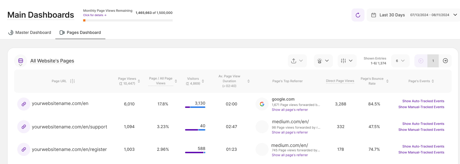
Pages Dashboard
The Pages Dashboard provides an overview of your website's pages, allowing you to analyze various page-specific metrics. It is a valuable tool for website owners and administrators to track and analyze the performance of individual pages and make data-driven decisions to improve the visitor experience and drive desired actions on their website.
For more detailed information about your website pages, you can also navigate to the Landing & Referrer Pages submodule.
Above the right side of the report block, you'll find the refresh button next to the date picker. It allows you to update the data instantly within your Pages Dashboard without reloading the entire page. You can also see the AI Assistant button for easy access.
You have the option to export your data in CSV, or XLSX format. This flexibility allows you to choose the format that best suits your needs and makes it convenient for you to work with the data in the way that is most comfortable or compatible with your tools and applications. Note: Exported data will only include the current table page.
Additionally, you can now apply visitor segments to get a more granular view of your data. While we'll discuss this feature in more detail later in this article, you can learn more about creating and managing segments in our full guide here.
There are two ways that you can filter the data that you can see on this report block:
- Add advanced filters to specify your results and/or group pages by page level
- Add filter by categories and defined values
You can also customize the number of entries shown per page and easily navigate through the data using pagination.
Important Notes:
- This report block is totally dependent on the selected time period.
- Select columns offer the option to sort the data, providing a tailored approach to organizing and navigating through the information. The current default sorting of the pages dashboard is by descending number of page views.
Data Visualization Option: Table View
Take control of how you see your website traffic! Our Pages Dashboard provides an overview of all your website's pages, displaying important page-specific metrics. You can use advanced filters to refine your results and group pages by their level, or apply visitor segments to quickly focus on key visitor groups.
We have two data visualization options you can choose from. The first is the Table View.
Here's a breakdown of the information you can access on the Pages dashboard:
- Page Title & URL: Shows the list of page URLs and the current default sorting is by descending number of page views.
- Page Views: This metric shows the total number of page views (formerly "visits") each page URL has received during the selected time period. It helps you understand the popularity of individual pages. The column header shows the sum of all page views.
- Page's Share in All Page Views: This shows you the number of page views the page has received in the selected period of time and sets it into relation to the overall website’s traffic in the selected time period ( in % ).
- Total Visitors: Shows the total number of visitors (both new and returning) who visited each page URL. The column header shows the sum of all visitors for all pages.
- Av. Page View Duration: This provides the average duration of sessions on each webpage, helping you understand how engaging and effective your pages are in holding visitors' attention. The column header shows the average page view duration of all pages.
- Page's Top Referrer: This shows the primary source or referrer for each page URL. It can be helpful in understanding how visitors are finding and arriving at your pages, whether through direct visits, search engines like Google, or other referral sources.
For a deeper dive into page traffic sources, click Show all page's referrer under any listed referrer. This link leads directly to the Referring Websites tab within the Landing & Referrer Pages submodule, offering a comprehensive breakdown. - Direct Page Views: The number of page views generated when visitors accessed the page by typing its URL directly into their browser's address bar during the selected time period.
- Clicks on Outgoing Links: This metric shows you the number of times any link was clicked on the selected page, which forwarded the visitor to a 3rd party domain during the set period of time.
- Page's Bounce Rate: This shows the bounce rate associated with each page URL.
- Page's Events: This column houses direct links to manage and view events relevant to this page. Clicking any of these two options will lead you to their designated tabs under Event Tracking:
- Show Auto-Tracked Events
- Show Manual-Tracked Events (not available on Wix)
Data Visualization Option: Split Table / Line Diagram

The Pages Dashboard just got an upgrade with a powerful new data visualization option: the split table / line diagram view. This feature empowers you to see trends alongside raw data, making it easier than ever to understand how your secondary metrics are performing over time.
This visualization includes the metrics displayed on the Table View, excluding Page's Top Referrer and Page's Events.
Paired with the table, a line chart provides a visual representation of the selected metric(s) over time, allowing you to easily spot trends and identify periods of significant growth or decline. For better analysis, the data within this chart can be grouped by days, weeks, months, or years.
Tailoring the View to Your Needs:
- Select one or more Page URLs from the table to analyze their performance.
- Click the dropdown menu on the right, then select the specific secondary metrics you want to visualize. We have the following secondary metrics:
- Page Views
- Page / All Page Views (%)
- Direct Page Views
- Total Visitors
- New Visitors
- Returning Visitors
- Average Page View Duration
- Bounce Rate (%)
- Click any data point to view more details, including the page URLs and number of page views received during the selected time period.
Filters for Pages Dashboard

Just like the Master Dashboard, you can apply various filters to the Pages Dashboard for enhanced analysis. It now offers powerful traffic channel filters, empowering you to easily focus on specific traffic sources (like organic search, social media, or direct traffic) for a more granular analysis of your website traffic.
To apply the filter, simply click the filter icon in the top right. For the traffic channels, select one of the available filter options below. This setup can be saved as a reusable filter template.
- Direct Visit
- Paid Ads
- Organic Search
- Social Media
- Other Referrals
- AI Traffic
Applying the Visitor Segments to the Pages Dashboard

Applying visitor segments helps you analyze specific visitor groups, giving you deeper insights into their behavior. If you haven't created any yet, you can find our full guide on how to create a visitor segment here.
You'll notice a distinctive Visitor Segment icon positioned on the right side of the page. Clicking this icon transforms it to a purple color, signaling its activation. A list of existing visitor segments will appear below "All Website's Pages”.
Additionally, you'll find an option labeled "Edit and Manage Visitor Segments" next to the visitor segments list. When this option is selected, it will redirect you to the Visitor Segments screen.
To apply the visitor segments, follow these steps:
- Select the visitor segment you want to apply to the website pages listed below.
- Once selected, a green checkmark will appear on the right side. You can select one or more segments.
- Below each page URL, the visitor segments with it's corresponding values will be listed separately based on the order in which they were selected.
Real-Time Analytics

Monitor your live visitor engagement with the new Real-Time Analytics (RTA) dashboard, found under Main Dashboards. It provides various live metrics that show how visitors are currently interacting with different pages of your website in real time.
The dashboard contains two report blocks that provide detailed information about all live activity on your website:
You can also open the Real-Time Analytics dashboard directly from the Master Dashboard by clicking the View Traffic Map button on the Live Visitors Map (Uniques) report block.
Additionally, to ensure your data remains current, you can configure the dashboard's auto-reload frequency using the settings in the upper right corner.
Real-Time Interaction - Table View

The Real-Time Interaction report provides an overview of which URLs are currently receiving the most live interactions. The table uses a page URL as the primary dimension. In addition, it displays various secondary metrics that reflect visitor traffic, interaction levels, and visitor intent. This allows you to identify in real time which website content is attracting particular attention and to take appropriate action.
To analyze your data effectively, we offer two distinct visualization formats: the Table View and the Split Table / Pie Diagram. You can switch between these views by clicking the icon located next to Real-Time Interaction in the report block.
The Table View visualization contains the following columns:
- Page Title & URL: Shows the title and web address of the page. Click directly on the link to open the page in a new tab. Or hover your mouse over the URL to see additional options in the context menu that appears.
- Live Sessions (Non-Unique): Displays the real-time, non-unique live sessions that have visited a page within the past 5 minutes. The live sessions are non-unique as they could potentially visit various pages at the same time.
- Ø Session Duration: Shows the average session duration of all non-unique live sessions per page. If the value is 00:00, it means that all currently tracked live sessions are still active. Given a 5-minute timeframe, this can occur while sessions are still browsing your website. The platform can only calculate average session duration after a session has ended.
- Ø Time Spent on Page: Shows the average time spent on page (mm:ss) of all non-unique live sessions per page. If the value is 00:00, it means that all currently tracked live sessions currently have exactly one page view. Given a 5-minute timeframe, this can occur when a session has not yet had the time to navigate to another page. The platform can only calculate the average time spent on a page after a session has finished visiting that page.
- Continuation Rate: Shows the percentage of non-unique live sessions that have moved on to at least one additional page on your website.
- Referrer Distribution: Shows the referrer distribution of a URL's non-unique live sessions. For a more detailed breakdown, simply hover your mouse over the relevant cell to view the associated tooltip.
- New & Returning Visitors (Non-Unique): Shows the real-time non-unique live visitors having visited a page within the past 5 minutes. The live visitors are non-unique as they could potentially visit various pages at the same time. To access additional data, hover your mouse over the cell to reveal a tooltip. This provides an immediate breakdown of the Visitor Type, identifying whether the visitor is a New or Returning Visitor.
- Loyal Visitors: A Loyal Visitor is defined as a visitor who has visited the website at least 8 of the last 16 days.
- Device Distribution: Displays the breakdown of devices used by a URL's non-unique live sessions. Hover your mouse over the cell to view a more detailed breakdown in the associated tooltip.
- OS Distribution: Shows the operating systems distribution of a URL's non-unique live sessions. For additional details, simply hover over the relevant cell to reveal the tooltip.
- Channel Distribution: Shows the traffic channel distribution of a URL's non-unique live sessions. Hover over any cell to view a detailed breakdown of the associated metrics.
- Country Distribution: Displays the country distribution of a URL's non-unique live sessions. Hover your mouse over the cell to view a more detailed breakdown in the associated tooltip.
- Browser Distribution: Shows the browser distribution of a URL's non-unique live sessions. Hover over any cell to view a detailed breakdown of the associated metrics.
Important Notes
- By default, the table is sorted by Live Sessions (Non-Unique) in descending order.
- The table header displays the Sum values for count-based metrics (such as visitors and sessions) and Average values for ratio or time-based metrics (such as duration and rate). These values are calculated based only on the currently displayed table rows and update automatically when filters are applied or table data changes.
- To refine your analysis, you can sort any column, apply filters, or adjust the number of entries displayed per page. Use the pagination controls to navigate the dataset or jump to a specific page.
- The Real-Time Interaction report block can now be added to custom dashboards. This allows for team-specific filtering based on the team members with whom the custom dashboard is shared.
Filters for Real-Time Interaction Report Block

Use the filtering tool to segment your data and uncover specific insights. You can apply multiple filters simultaneously to drill down into niche traffic segments.
How to Manage Filters
- Apply a Filter: Click the Filter Icon, select your criteria, enter your values, and click Submit.
- Save a Template: After setting your filters, click Save set filters for report block, name your template, and click Save Changes.
- Use a Saved Template: Click the Filter Icon, navigate to the Report’s Saved Filters tab, select your template, and click Submit.
- Edit Templates: Use the Pencil Icon to rename a template or select Delete Template to remove it.
Real-Time Interaction - Split Table / Pie Diagram

The Split Table / Pie Diagram visualization is ideal for analyzing data as proportions of a whole. When you select this option, all shown pages in the table are automatically selected to provide a comprehensive initial overview.
The report block is divided into two main sections. The table remains on the left side, while a dynamic pie chart appears on the right to display the combined distribution of all selected pages which you have selected within the dropdown above it.
The color breakdown is displayed directly inside the pie chart for quick reference. Each color within the pie chart represents a specific element of the selected distribution. This layout allows you to see the raw data and its proportional impact simultaneously.
A dropdown at the top of the chart allows you to switch between different secondary metrics. You can choose from the following distributions to update the pie chart:
- Referrer Distribution
- Live Visitors Distribution
- Device Distribution
- OS Distribution
- Channel Distribution (selected by default)
- Country Distribution
- Browser Distribution
Important Notes
Changing the number of entries displayed will automatically select all pages in the table to be considered within the pie chart. You can manually select or deselect specific pages to compare your data.
Hovering over any segment of the pie chart reveals a tooltip with a detailed breakdown of the data for that page.
- Resize the table and chart sections using the horizontal arrow icon located between the two sections.
Live Visitors Map (Uniques)
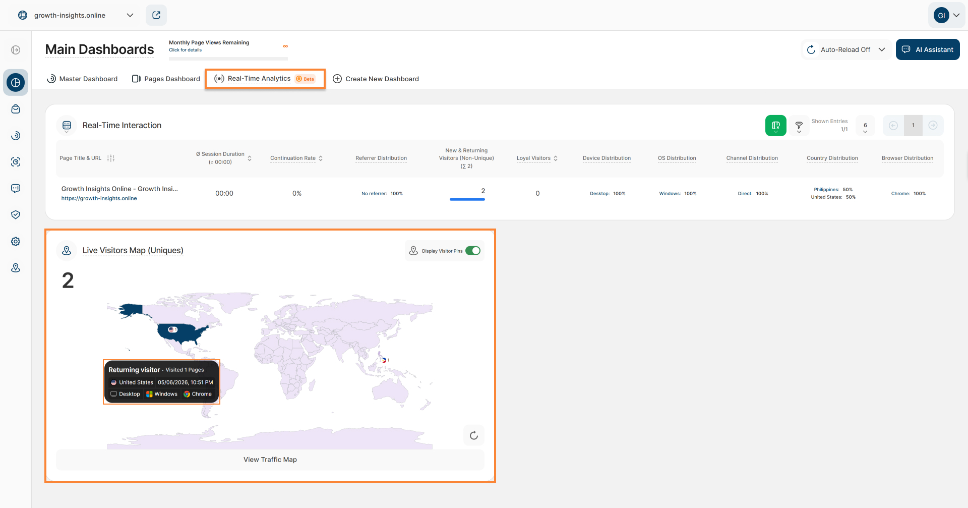
The Live Visitors Map (Uniques) report block displays the number of unique visitors who accessed or are currently accessing your website within the last 5 minutes. This report block can also be found in the Master Dashboard.
You can view visitor geo-locations as pins on the map once the Display Visitor Pins toggle is enabled (in the upper right corner of the report block). When you click on a highlighted pin area, a tooltip will open with the following detailed visitor information:
- Visitor Type: Shows whether each visitor is new or returning.
- Visited Pages: Shows the number of visited pages in the current session.
- Country: Displays the flag and name of the country of origin from which the session is being conducted.
- Date: Displays the exact date and time when the visitor session began.
- Device Information: Displays the device type, operating system, and browser used by the visitor.
To ensure maximum accuracy, you can manually reload the map by selecting the Reload icon situated at the lower right of the report block.
Scroll with your mouse wheel to zoom, or click View Traffic Map at the bottom to navigate to the Latest Visitors Map. This view displays all visitors for the chosen time range according to their specific geographic coordinates.
Create New Dashboard

The "Create New Dashboard" feature offers the ability to craft custom dashboards and grant access to existing website contributors. Whether utilizing default report blocks for quick insights or customizing the dashboard to specific needs, it offers a versatile approach to gaining a deep understanding of website performance.
This flexibility ensures that users can swiftly access relevant metrics, empowering informed decision-making and fostering a cohesive understanding among team members and contributors.
Important Note: Access to this feature requires the purchase of a minimum pricing plan.
Some General Hints
- Custom dashboards can only be created by the website owner and are set to private by default. Other actions an Owner can perform include:
- Editing the name of the custom dashboard.
- Adding report blocks from the default selection.
- Moving or deleting report blocks within the custom dashboard.
- Defining report-specific filtering where available (e.g., by URL, etc.).
- Granting access to website contributors to view or edit a custom dashboard.
- Website contributors granted Editor access can now edit existing custom dashboards. They can modify dashboard report blocks (RBs), and adjust dashboard filters.
- Contributors with Custom Dashboard Viewer only see the specific data that has been filtered or segmented by the owner or editor. Viewers cannot update the data in the individual dashboard, nor can they click on links to access other functions within the platform.
- Clicking “Create New Dashboard” on an ineligible plan will trigger an upgrade modal. This displays your current plan, the necessary upgrade, and an “Upgrade Plan” button.
How to Create a New Dashboard

Creating a new dashboard lets you see and understand data in your own way. This guide will walk you through making your dashboard step by step, so you can organize and understand data for better decisions. Whether you're experienced or new to this, the guide makes creating your dashboard easy, turning data into useful insights.
- Tap the Create New Dashboard button and give your dashboard a meaningful title up to 50 characters long. This makes it easier to identify and organize your data at a glance.
- Once you create your new dashboard, you'll enter the "edit mode." Here, you can freely add report blocks and tailor your dashboard to perfectly suit your needs.
- Click the Add Report Block to Custom Dashboard button to open a modal with two tabs, where you can browse and select the report blocks you want to include:
- Pre-Defined Report Blocks: This option offers various predefined report blocks, and we constantly update this list with new options. Hint: Hover over a report block for a quick preview.
- Custom Report Blocks: This option will be available soon, offering additional customization.
- After adding the selected report blocks, you will see additional three icons on the top right of each report block implying the actions below:
- Edit Data Shown In Report: This allows you to modify the data displayed within the report (only available on some customizable report blocks).
- Move Report Block Within Custom Dashboard: Enables you to reposition the report block within the dashboard.
- Remove Report Block From Custom Dashboard: This action removes the specific report block from this dashboard only, without affecting its existence elsewhere.
- Once you've completed the necessary edits and adjustments to your dashboard, click on the Save Changes button located in the header.
Dashboard Options

Manage your custom dashboard settings by selecting the three-dot menu, which includes the following dashboard options:
- Edit Dashboard Name: Rename the custom dashboard (maximum of 50 characters).
- Edit Dashboard’s Data & Reports: Enter the custom dashboard's edit mode, where you can add or remove reports, and update filters or segments. This option is now available to both the Owner and contributors with Editor access.
- Edit Dashboard Access (not applicable for Wix/3AS due to the absence of existing contributors ): Grant access to existing website contributors.
- Delete Custom Dashboard: Permanently remove the dashboard (requires a secondary confirmation). Only the Owner can delete the dashboard; once removed, access will be revoked for any users who had permission to view it.
Share Dashboard

By default, custom dashboards are private and accessible only to the website owner. To share access, click Edit Dashboard Access to open the Share Dashboard modal. The default permission for all contributors is “No Access”.
To grant access to your website contributors:
- Browse the list of active website contributors or use the search box to find them by name.
- The left side of the list displays each contributor’s name, current website role, and email address.
- On the right, you’ll see their current dashboard permission. Use the dropdown menu to select one of three permission levels:
- Editor: Can view and make changes to the custom dashboard.
- View Only: Can view but cannot edit the custom dashboard.
- No Access: Cannot view the custom dashboard.
- If a contributor isn’t listed, click Manage Website Contributors to add them as contributors before you can grant them dashboard access.
- Click Save Changes to apply your updates, or Close to exit without saving.
Important Note: A contributor’s Website Role defines their general site permissions, whereas Dashboard Access is set on a per-dashboard basis. This allows you to invite a Website Editor to your team without necessarily granting them access to custom dashboards.
Customize Report Block Names

You can now personalize the names of the report blocks in the custom dashboards for tailored insights. In the custom dashboard’s edit mode, you can see the report block’s (RB) name displayed as a “field.”
Follow these simple steps to edit the Report Blocks name:
- Click the pencil icon.
- Tap the report block name field and type in the preferred name.
- Tap the checkmark icon to save the changes or the X icon to discard them.
Alternatively, you can click the “Save Changes” button on the top right of this view. Once saved, you’ll see a confirmation “Your changes were saved successfully!”.
Important Notes:
- Access to the Custom Dashboard feature requires the purchase of a minimum pricing plan.
- Changes made to the Report Block names apply only to the custom dashboard. These changes do not impact the default naming of the Report Blocks (RBs).