- Why Us?
- Features
White Label
For SaaS Platforms & Agencies
Provide our complete analytics suite to your clients, directly within your own interface and with your/their own branding. Discover Analytics-as-a-Service and White Label Analytics. Great benefit, minimal effort.
- Pricing
- White Label
- Success Stories
- Partner
- ResourcesExpand Your Knowledge
- First Steps Checklist
-
Frequently Asked Questions
-
All About Features
- How to Install the Tracking Code
-
User Guides
-
Integrating With Other Platforms
-
Legal, Data Privacy & Certificates
- TWAIA Addendum
- White Label Analytics
- Glossary
- Contact
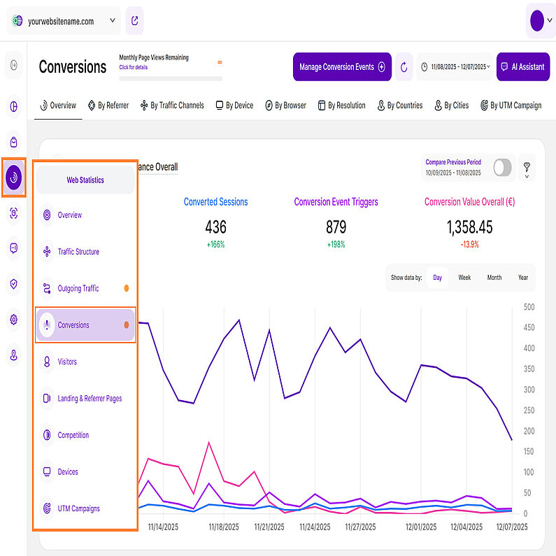
Conversions
Understand How Your Visitors Convert
The Web Statistics module has a new addition we're excited to introduce: Conversions. The Conversions submodule will provide you with all the information you need regarding your individually defined conversion events. You can track and analyze specific events that are most important to your business, such as a successful purchase, a form submission, or a newsletter sign-up. This gives you the insights to effectively measure success, identify opportunities, and optimize your entire strategy.
Set the Date
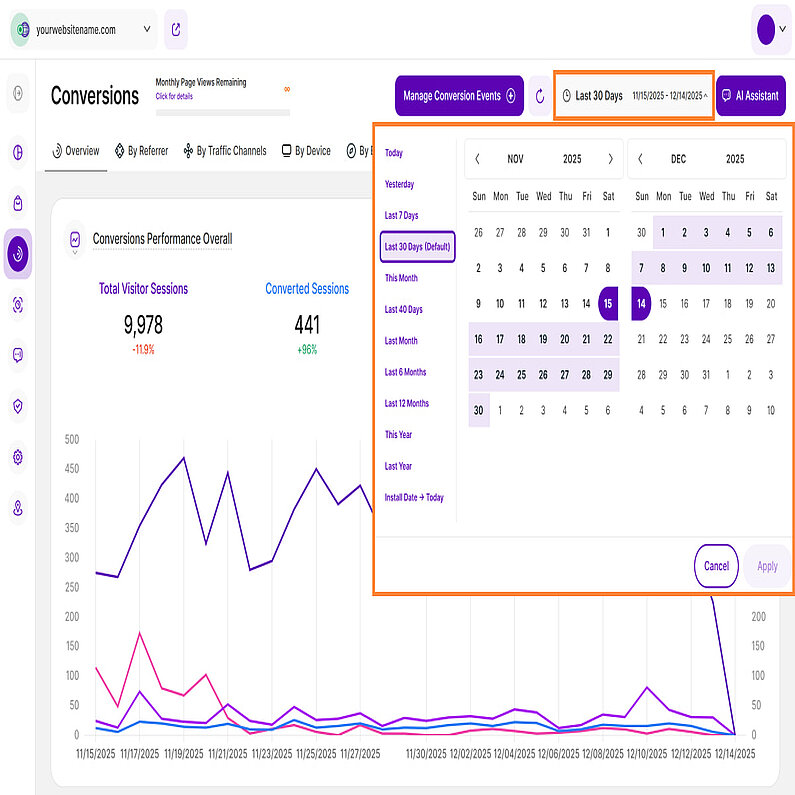
Right above the tiles, you can see a date picker. This enables you to select a certain time period or specific day to which you want the dashboard's data to correspond.
It is crucial to limit the presentation of data to specific dates or timeframes during which you executed potential campaigns or implemented other strategies. This will allow you to assess the effectiveness of these actions and use the insights gained for future planning.
Important Notes: The app now remembers previously set segments, filters, filter templates, and date intervals, even when you navigate away from the page, log out, or log back in. When your session expires or you close the tab, it automatically switches back to the default setting of "Last 30 Days."
Some General Hints
- Make sure you have updated your app so you can benefit from this feature.
- A lot of elements contain descriptions if you hover over them. Just let your cursor run over various elements and discover how much data is actually packed into a tile.
- We've made accessing tooltips easier and less cluttered within the app. Here's how it works:
- Page header titles, RB titles, and Section headers: These tooltips now appear only when you click on the element itself.
- Tabs: The tooltip will be available by clicking only if the tab is currently active.
Hint: Look for a dashed underline on clickable elements to identify those with tooltips.
- Tooltips now display the abbreviated day of the week wherever dates are available. This will help you identify trends and analyze website traffic in relation to the days of the week.
- Each metric shows a percentage beneath it, which represents a comparison with the previous equivalent period. They can be:
- Green ( You’re on track! ): The data presented has improved in comparison to the previous period.
- Red ( You have work to do! ): The data presented has worsened in comparison to the previous period.
This color scheme allows you to see whether your website is on a good track or not – if all or most of your KPIs are green, things are working out as they should. If all or most of them are red, you should take action.
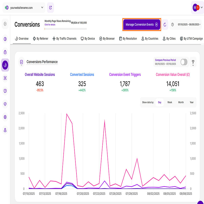
Start by defining your conversion events so you can begin seeing data. To do this, click the Manage Conversion Events button in the top right.
You can find a complete, step-by-step guide in our article: Conversions.
Overview
Now that you've defined your conversion events, let's explore how they are measured and how that data impacts your website's performance.
The Overview tab contains two report blocks with data for your selected time period:
This report block features a line diagram by default that compares the performance of your website's overall sessions (independent of whether a session converted or not), the number of conversion events triggered and the conversion value generated overall in the selected period of time. You can learn more about our data visualization options here. You can define conversion events and their respective values under Website Settings > Conversions.
Within this module, you'll find an overview of the most useful conversion KPIs for your website's conversions on a selectable timescale::
- Overall Website Sessions
- Converted Sessions
- Conversion Event Triggers
- Conversion Value Overall (£)
At the top right of this report block, you’ll find the Compare radio button that enables the following data comparison options:
- Compare Previous Period: Compares the current data to the previous period (if it exists).
- Compare Year over Year: Compares the current data to the same period of the previous year(if it exists).
You can now compare your current data to the previous period or compare it year over year. You’ll also find the dates covered by the previous period or year, for example, 07/02/2025 - 08/02/2025. This enables you to get a better view of your current data compared to the previous equivalent period or year. The lines in lighter shades represent the data from the previous time period.
Next to the Compare radio button, you'll find the improved filter icon, giving you even more control over your data analysis. You can filter this dashboard by the following Conversion Event Types:
- Visit of Website's Page URL
- Visit of Website's Custom URL Pattern
- Outgoing Traffic
- Auto-Event
- Custom Event
- eCommerce Event
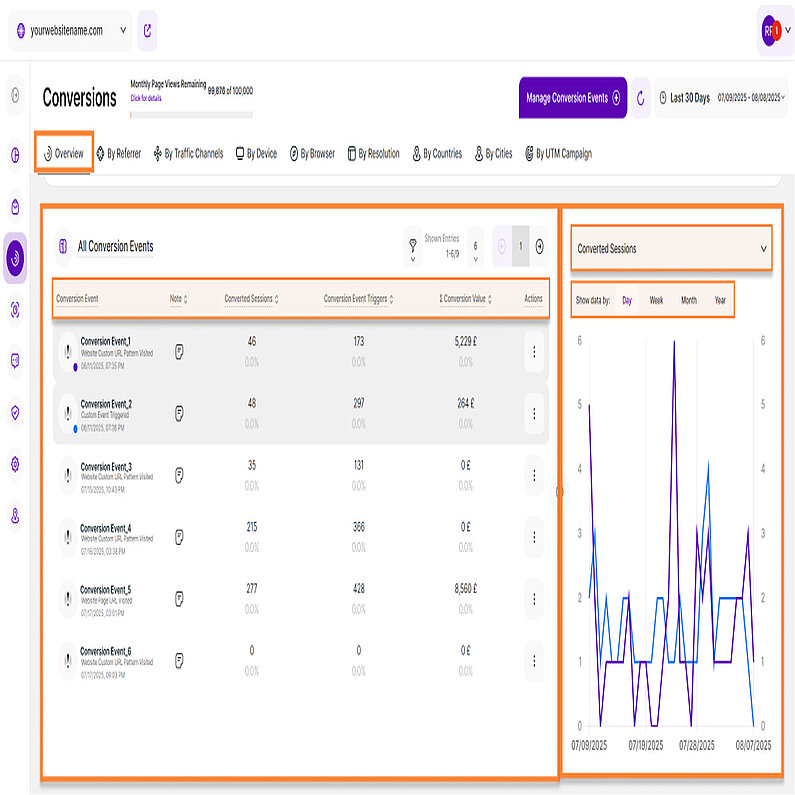
This report block provides you a quick overview of all conversion events that were defined for this website under Website settings > Conversions. To help you analyze this data effectively, we offer a Split Table / Line Diagram visualization option.
On the left is the All Conversion Events table. For each conversion event, you will see the amount of converted sessions, how often it was triggered and the generated sum of its conversion value.
Hint: The table also shows those conversion events that weren't triggered throughout the selected period of time.
This table has six columns:
In order to view a conversion event's historical development you can simply click on it within the table. A respective line will appear within the right part of the report block.
- Conversion Event: List of all those conversion events that were defined for this website under website settings > conversions. The table also shows conversion events that weren't triggered throughout the selected period of time. Click on one or multiple conversion event(s) to see their historical development within the right part of the report block. Each conversion event icon has a colored dot in the lower right corner to link the element visually with the line within the line diagram element on the right.
- Note: Note that was optionally added to a conversion event.
- Converted Sessions: This metric shows the number of website sessions that triggered a conversion event at least once in the selected period of time and are hence considered a converted session.
- Conversion Event Triggers: This column displays how often a conversion event was triggered by all your website visitors throughout the selected period of time.
- Σ Conversion Value: The overall conversion value of a conversion event is calculated by multiplying the number of a conversion event's triggers within the selected period of time by the monetary conversion value that was manually added to the event.
- Actions: For each conversion event, a three-dot menu offers additional actions. Clicking on the menu and selecting 'View This Conversion Event By' will redirect you to a new tab in the Conversions submodule, where you can find a more detailed view of the selected event. Here are the eight options available:
- Referrer
- Traffic Channel
- Device
- Browser
- Resolutions
- Country
- City
Important Notes:
- Apply filters to refine your data. You can also customize the number of entries per page and use pagination to navigate through the results.
- Sort the data by clicking on any of the column headers. By default, events are sorted by their creation date, from oldest to newest.
- Resize the table and chart sections using the horizontal arrow icon.
- You can compare data by selecting one or more conversion events.
The line diagram on the right side displays data for the selected conversion event. You can use the dropdown menu at the top right to choose which secondary metric to display.
We have three secondary metrics:
- Converted Sessions (default metric)
- Conversion Event Triggers
- Conversion Value
Click any data point to view more details, including the date range, conversion event and the value of the selected secondary metric.
For better analysis, the data can be grouped by days, weeks, months, or years within this chart.
By Referrer
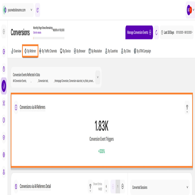
This tab focuses on conversion events by referrers. Above the report blocks, you’ll find a dropdown menu titled ‘Conversion Events Reflected in Data’. You can use this menu to select or deselect the conversion events shown in your data.
This tab contains two report blocks with data for your selected time period:
This report block focuses on a single KPI, showing the number of triggered conversion events by sessions that reached your website via a referrer. It helps you to understand which referrers generate most conversion value.
To refine your analysis, use the filter option at the top left. The following filter categories are available:
- Conversion Rate
- Conversion Value
- Converted Sessions
- Referrer URL
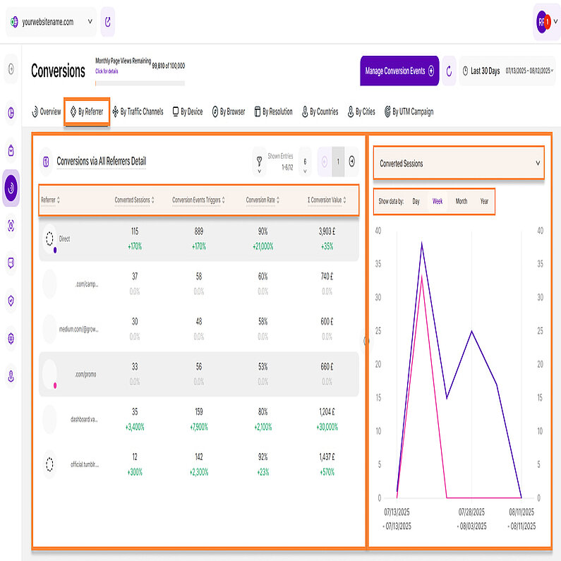
This report block shows all referrers that have forwarded sessions to the website which triggered at least one conversion event in the selected time period. To help you analyze this data effectively, we offer a Split Table / Line Diagram visualization option.
The table on the left displays conversions from all referrers and is organized into five columns.
- Referrer: Shows all the website's referrers that have forwarded sessions which triggered at least one conversion event in the selected time period. On the left, each referrer's favicon has a colored dot that visually links it to the corresponding line in the line diagram on the right.
- Converted Sessions: This metric shows the number of website sessions that triggered a conversion event at least once in the selected period of time visiting your website via a specific referrer and are hence considered a converted session.
- Conversion Events Triggers: This column displays how many triggers of conversion events were generated by sessions visiting your website via a specific referrer in the selected time period.
- Conversion Rate: The conversion rate shows you what percentage of all sessions that visited your website via a specific referrer in a selected time period have triggered at least one conversion event. The comparison is shown as a percentage.
- Σ Conversion Value: The total conversion value of a referrer is calculated by multiplying the number of triggers of all conversion events generated via the sessions of a specific referrer within the selected time period by their respective monetary conversion values.
Important Notes:
- Apply filters to refine your data. You can also customize the number of entries per page and use pagination to navigate through the results.
- Click any of the column headers to sort the data. By default, the table is sorted alphabetically by referrer.
- Resize the table and chart sections using the horizontal arrow icon.
The line diagram on the right side displays data for the selected referrer. You can use the dropdown menu at the top right to choose which secondary metric to display.
We have four secondary metrics:
- Converted Sessions (default metric)
- Conversion Event Triggers
- Conversion Value
- Conversion Rate
Click any data point to view more details, including the date range, referrers name or URL and the value of the selected secondary metric.
For better analysis, the data can be grouped by days, weeks, months, or years within this chart.
By Traffic Channels
Similar to other tabs, the By Traffic Channels tab displays two report blocks for your selected time period:
Above the report blocks, you'll find a dropdown menu titled 'Conversion Events Reflected in Data' that you can use to customize which events are displayed in your data.
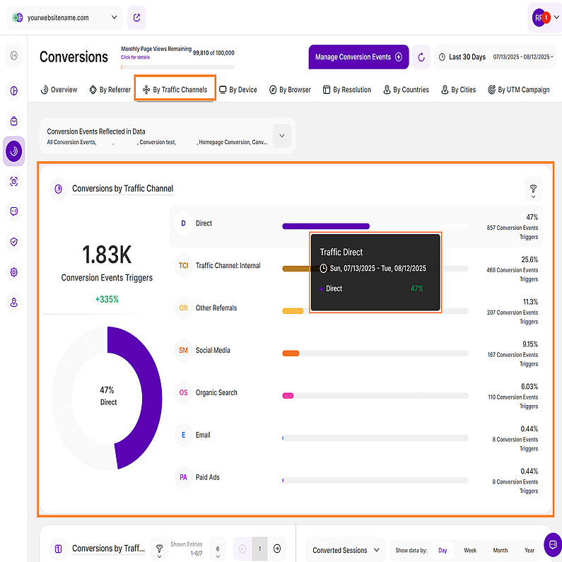
This report block shows the number of triggered conversion events by sessions reaching your website via a specific traffic channel. It helps you to understand which traffic channels generate the most conversion value.
Here is a breakdown of the traffic channels and how are they determined:
- Direct: This refers to visitors who come to your website by directly typing your website's URL into their web browser's address bar. In cases where the source of the traffic is uncertain, it's still considered as direct.
- Email: Traffic that originates from email marketing campaigns. It's tracked when specific tags are included as parameters in the URLs within your email campaigns.
- Paid Ads: Traffic that comes from search engine results of paid advertising (either across search ads or due to a targeting strategy).
- Organic Search: This traffic comprises visitors who discovered your website through search engine results like those from Google or Bing. Importantly, this traffic is unpaid and is based on the natural search results.
- Social Media: Traffic that originates from social media platforms such as Facebook, Instagram, LinkedIn, Twitter, and other similar platforms.
- Other Referrals: This traffic is gained when visitors learn about your website by clicking on links from other websites or apps. These links come from various sources on the internet and are distinct from search engine referrals.
- Traffic Channel: Internal: This traffic measures the number of conversion events triggered during the selected period by users who have already visited at least one other page on the website.
Now that we’ve learned about the traffic channels, let's delve into understanding the data we have collected. This report block features a Pie Chart View visualization which shows both a pie and a bar chart, highlighting the overall conversion events triggered by a particular channel’s sessions.
Located on the top left, just above the pie chart, you'll find the total number of Conversion Events Triggers tracked within the selected time frame. Hover your cursor over the traffic channels listed to view a detailed breakdown of the Conversion Events Triggers tracked through each channel. Additionally, you can hover over the segments of the pie chart to reveal the corresponding percentages.
Each bar in this chart represents a different traffic channel. To the right of each bar, you'll see a percentage indicating its contribution to the total conversion events triggers, with the exact number of events triggered listed directly below. It's sorted by the number of conversion events triggered, from highest to lowest.
For a more focused analysis, use the filter option at the top right of this report block. The following filters are available:
- Conversion Rate
- Conversion Value
- Converted Sessions
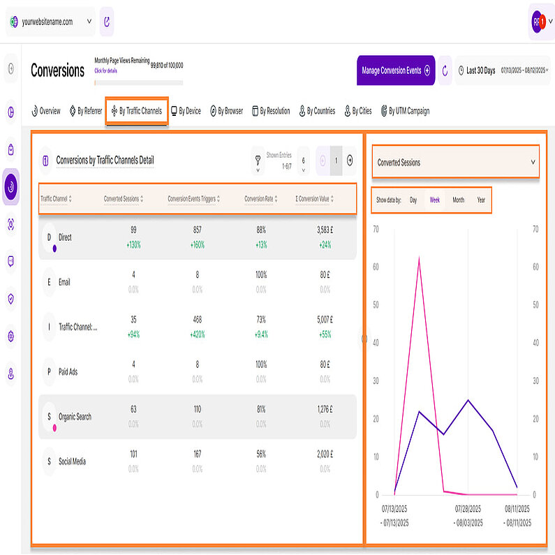
This report block provides more details on a traffic channel's conversion performance. You can see a channel's number of converted sessions, conversion events triggered, conversion rate and conversion value in a selected period of time. Clicking on a traffic channel within the left table part will show you a respective metric's historical development on the right side. To help you analyze this data effectively, we offer a Split Table / Line Diagram visualization option.
The table on the left displays the conversions by traffic channels and it has five columns:
- Traffic Channel: Shows the website's traffic channels which contain sessions which triggered at least one conversion event in the selected period of time. Each traffic channel icon has a colored dot in the lower right corner to link the element visually with the line within the line diagram element on the right.
- Converted Sessions: This metric shows the number of website sessions that triggered a conversion event at least once in the selected period of time and are hence considered a converted session.
- Conversion Events Triggers: This column displays how many triggers of conversion events were generated by sessions visiting your website via a specific traffic channel in the selected time period.
- Conversion Rate: The conversion rate shows you what percentage of all sessions that visited your website via a specific traffic channel in a selected time period have triggered at least one conversion event.
- Σ Conversion Value: The total conversion value of a traffic channel is calculated by multiplying the number of triggers of all conversion events generated via the sessions of a specific traffic channel within the selected time period by their respective monetary conversion values.
Important Notes:
- Apply filters to refine your data. You can also customize the number of entries per page and use pagination to navigate through the results.
- Click any of the column headers to sort the data. By default, the table is sorted alphabetically by traffic channel.
- Resize the table and chart sections using the horizontal arrow icon.
The line diagram on the right displays data for the selected traffic channel. You can use the dropdown menu at the top right to choose which secondary metric to display.
We have four secondary metrics:
- Converted Sessions (default metric)
- Conversion Event Triggers
- Conversion Value
- Conversion Rate
Click any data point to view more details, including the date range, traffic channel, and the value of the selected secondary metric.
You can also group the data by days, weeks, months, or years for a more detailed analysis.
By Device
The By Device tab displays two report blocks for your selected time period:
Above the report blocks, you'll find the 'Conversion Events Reflected in Data' dropdown menu that lets you customize which events are displayed in your data.
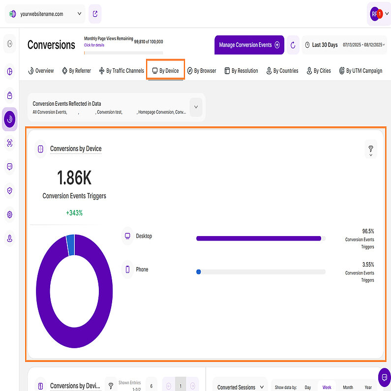
This report block features a KPI View visualization which shows both a pie and a bar chart, highlighting the overall amount of triggers of all the website's conversion events in a selected period of time sorted by device type.
We have three KPIs for this report block:
- Desktop: Shows the amount of conversions that were generated by website visitors using a desktop device.
- Mobile: Displays the amount of conversions that were generated by website visitors using a mobile device.
- Tablet: Shows the amount of conversions that were generated by website visitors using a tablet device.
Located on the top left, just above the pie chart, you'll find the total number of Conversion Events Triggers tracked within the selected time frame. Hover over the segments of the pie chart to reveal the corresponding percentages.
Each bar in this chart represents a different device type. To the right of each bar, you'll see a percentage that shows its contribution to the total conversion events. The list is sorted by the percentage, from highest to lowest.
For a more focused analysis, use the filter option at the top right of this report block. The following filters are available:
- Conversion Rate
- Conversion Value
- Converted Sessions
- Device Type
This report block shows all device types that have forwarded sessions to the website which triggered at least one conversion event in the selected time period. To help you analyze this data effectively, we offer a Split Table / Line Diagram visualization option.
The table on the left displays conversions by device type, which is organized into five columns:
- Device: Shows all device types that have forwarded sessions to this website which triggered at least one conversion event in the selected time period. Each device icon has a colored dot in the lower right corner to link the element visually with the line within the line diagram element on the right.
Hint: You might also see an 'Unknown' value, which accounts for any conversions that couldn't be associated with one of the three device types. - Converted Sessions: This metric shows the number of website sessions that triggered a conversion event at least once in the selected period of time and are hence considered a converted session.
- Conversion Events Triggers: This column displays how many triggers of conversion events were generated by sessions visiting your website via a specific device in the selected time period.
- Conversion Rate: The conversion rate shows you what percentage of all sessions that visited your website via a specific device type in a selected time period have triggered at least one conversion event.
- Σ Conversion Value: The total conversion value of a device type is calculated by multiplying the number of triggers of all conversion events generated via the sessions of a specific device type within the selected time period by their respective monetary conversion values.
Important Notes:
- Apply filters to refine your data. You can also customize the number of entries per page and use pagination to navigate through the results.
- Click any of the column headers to sort the data. By default, the table is sorted alphabetically by device type.
- Resize the table and chart sections using the horizontal arrow icon.
- You can compare data by selecting one or more device types.
The line diagram on the right side displays data for the selected device type. You can use the dropdown menu at the top right to choose which secondary metric to display.
We have four secondary metrics:
- Converted Sessions (default metric)
- Conversion Event Triggers
- Conversion Value
- Conversion Rate
To see more details, click any data point. This will show you the date range, device type, and the value of the selected secondary metric.
You can also group the data by days, weeks, months, or years for a more detailed analysis.
By Browser
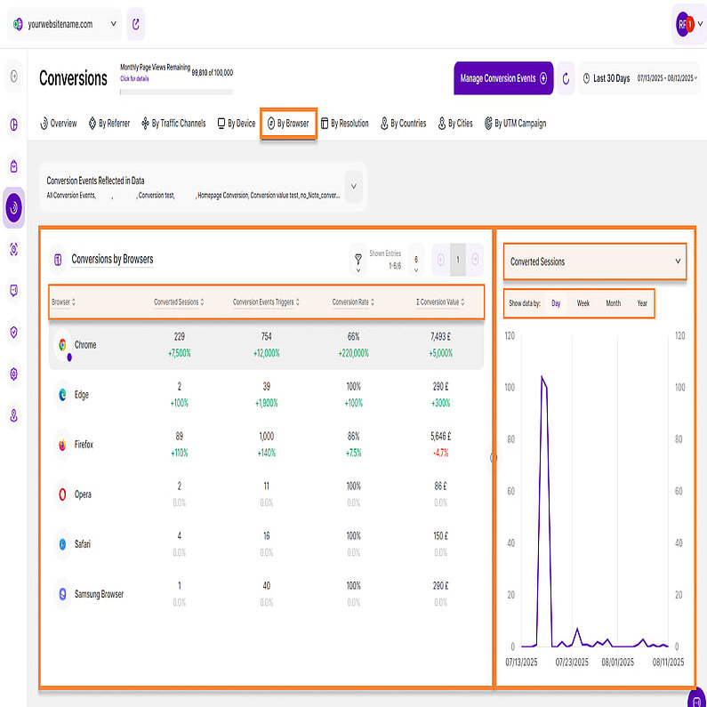
The By Browser tab displays a single report block with data for your selected time period. Like other tabs, you can use the 'Conversion Events Reflected in Data' dropdown menu to customize which events are shown in the report.
Conversions by Browsers
This report block shows you the overall amount of triggers of all the website's conversion events in a selected period of time sorted by browser. It features a Split Table / Line Diagram to help you analyze this data.
The table on the left displays conversions from all browsers and is organized into five columns.
- Browser: Shows all browsers that have forwarded sessions to the website which triggered at least one conversion event in the selected time period. Each browser icon has a colored dot in the lower right corner to link the element visually with the line within the line diagram element on the right.
- Converted Sessions: This metric shows the number of website sessions that triggered a conversion event at least once in the selected period of time and are hence considered a converted session.
- Conversion Events Triggers: This column displays how many triggers of conversion events were generated by sessions visiting your website via a specific browser in the selected time period.
- Conversion Rate: The conversion rate shows you what percentage of all sessions that visited your website via a specific browser in a selected time period have triggered at least one conversion event.
- Σ Conversion Value: The total conversion value of a browser is calculated by multiplying the number of triggers of all conversion events generated via the sessions of a specific browser within the selected time period by their respective monetary conversion values.
Important Notes:
- To refine your data, use the filter option. You can also customize the number of entries per page and navigate through the results using pagination.
- Click any of the column headers to sort the data. By default, the table is sorted alphabetically by browser.
- Resize the table and chart sections using the horizontal arrow icon.
The line diagram on the right side displays data for the selected browser. You can use the dropdown menu at the top right to choose which secondary metric to display.
We have four secondary metrics:
- Converted Sessions (default metric)
- Conversion Event Triggers
- Conversion Value
- Conversion Rate
Click any data point to view more details, including the date range, browser and the value of the selected secondary metric.
For better analysis, you can group the data by days, weeks, months, or years.
By Resolution
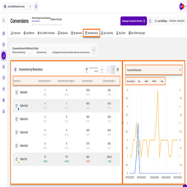
This tab displays a report block with data for conversion by resolutions from your selected time period. Similar to other tabs, you can use the 'Conversion Events Reflected in Data' dropdown menu to customize which events are shown in the report.
This report block shows you the overall amount of triggers of all the website's conversion events in a selected period of time sorted by resolution. It features a Split Table / Line Diagram to help you analyze this data.
The table on the left displays conversions from all resolutions, which is organized into five columns:
- Resolution: Shows all device resolutions that have forwarded sessions to the website which triggered at least one conversion event in the selected time period. Each resolution icon has a colored dot in the lower right corner to link the element visually with the line within the line diagram element on the right.
- Converted Sessions: This metric shows the number of website sessions that triggered a conversion event at least once in the selected period of time and are hence considered a converted session.
- Conversion Events Triggers: This column displays how many triggers of conversion events were generated by sessions visiting your website via a specific device resolution in the selected time period.
- Conversion Rate: The conversion rate shows you what percentage of all sessions that visited your website via a specific device resolution in a selected time period have triggered at least one conversion event.
- Σ Conversion Value: The total conversion value of a device resolution is calculated by multiplying the number of triggers of all conversion events generated via the sessions of a specific device type within the selected time period by their respective monetary conversion values.
Important Notes:
- Apply filters to refine your data. You can also customize the number of entries per page and use pagination to navigate through the results.
- Click any of the column headers to sort the data. By default, the table is sorted by screen resolution size.
- Resize the table and chart sections using the horizontal arrow icon.
The line diagram on the right side displays data for the selected resolution. You can use the dropdown menu at the top right to choose which secondary metric to display.
We have four secondary metrics:
- Converted Sessions (default metric)
- Conversion Event Triggers
- Conversion Value
- Conversion Rate
Click any data point to view more details, including the date range, resolution, and the value of the selected secondary metric.
You can also group the data by days, weeks, months, or years for a more detailed analysis.
By Countries
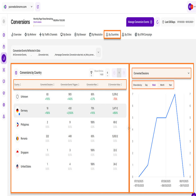
The By Countries tab displays a single report block with data from your selected time period. Above the report block, you can use the Conversion Events Reflected in Data' dropdown menu to customize which events are displayed in your dashboard.
This report block shows you the overall amount of triggers of all the website's conversion events in a selected time period sorted by country. It uses a Split Table / Line Diagram visualization to help you analyze this data effectively.
The table on the left displays conversions from all countries, organized into five columns:
- Country: Shows all countries that have forwarded sessions to the website which triggered at least one conversion event in the selected time period. Each country icon has a colored dot in the lower right corner to link the element visually with the line within the line diagram element on the right.
Hint: You might also see an 'Unknown' value listed at the top of the column. This value accounts for any conversions that couldn't be associated with a specific country. - Converted Sessions: This metric shows the number of website sessions that triggered a conversion event at least once in the selected period of time and are hence considered a converted session.
- Conversion Events Triggers: This column displays how many triggers of conversion events were generated by sessions visiting your website via a specific country in the selected time period.
- Conversion Rate: The conversion rate shows you what percentage of all sessions that visited your website via a specific country in a selected time period have triggered at least one conversion event.
- Σ Conversion Value: The total conversion value of a country is calculated by multiplying the number of triggers of all conversion events generated via the sessions of a specific country within the selected time period by their respective monetary conversion values.
Important Notes:
- Use filters to refine your data. You can also customize the number of entries per page and navigate through the results using pagination.
- To sort the data, click any of the column headers. By default, the table is sorted alphabetically by country. You can also resize the table and chart sections by dragging the horizontal arrow icon.
- You can compare data by selecting one or more countries.
On the right is a line diagram that displays the data for the selected country. You can use the dropdown menu at the top right to choose which secondary metric to display.
We have four secondary metrics:
- Converted Sessions (default metric)
- Conversion Event Triggers
- Conversion Value
- Conversion Rate
Click any data point to view more details, including the date range, country and the value of the selected secondary metric.
For better analysis, the data can be grouped by days, weeks, months, or years within this chart.
By Cities
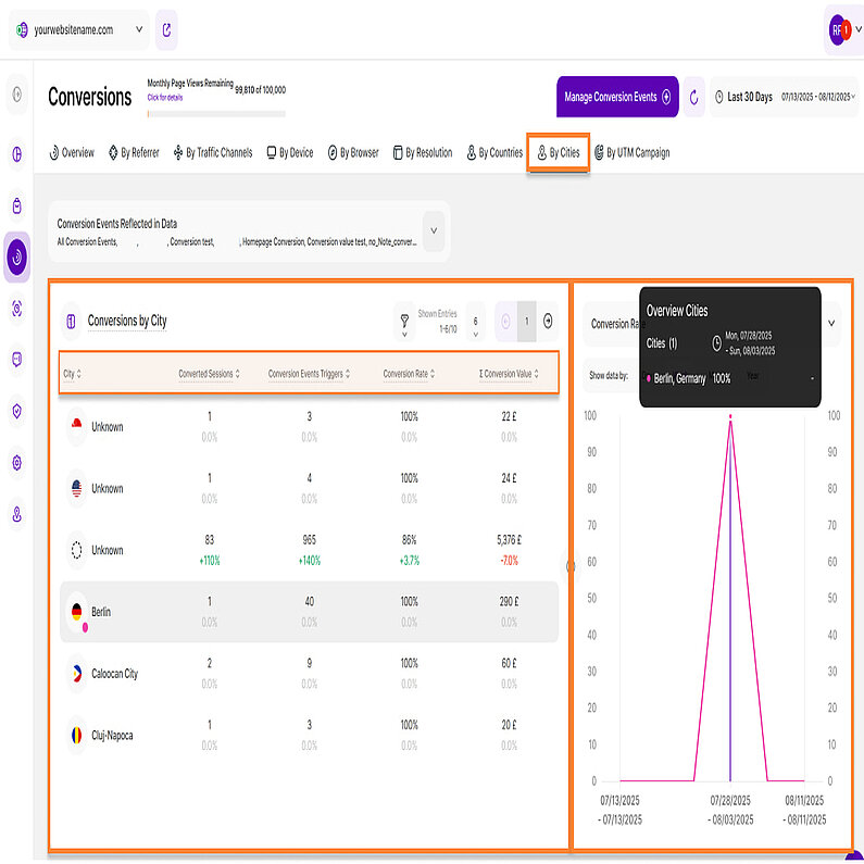
The By Cities tab displays a single report block with data based on the selected time period. You can use the 'Conversion Events Reflected in Data' dropdown menu, located above the report block, to customize which events are displayed.
This report block shows you the overall amount of triggers of all the website's conversion events in a selected period of time sorted by city.
The table on the left displays conversions from all cities, organized into five columns:
- City: Shows all cities that have forwarded sessions to the website which triggered at least one conversion event in the selected time period.
Hint: You might also see an 'Unknown' value listed at the top of the column. This value accounts for any conversions that couldn't be associated with a specific city. - Converted Sessions: This metric shows the number of website sessions that triggered a conversion event at least once in the selected period of time and are hence considered a converted session.
- Conversion Events Triggers: This column displays how many triggers of conversion events were generated by sessions visiting your website via a specific city in the selected time period.
- Conversion Rate: The conversion rate shows you what percentage of all sessions that visited your website via a specific city in a selected time period have triggered at least one conversion event.
- Σ Conversion Value: The total conversion value of a city is calculated by multiplying the number of triggers of all conversion events generated via the sessions of a specific city within the selected time period by their respective monetary conversion values.
Important Notes:
- Apply filters to refine your data. You can also customize the number of entries per page and use pagination to navigate through the results.
- Click any of the column headers to sort the data. By default, the table is sorted alphabetically by city.
- Resize the table and chart sections using the horizontal arrow icon.
- You can compare data by selecting one or more cities.
The line diagram on the right side displays data for the selected city. You can use the dropdown menu at the top right to choose which secondary metric to display.
We have four secondary metrics:
- Converted Sessions (default metric)
- Conversion Event Triggers
- Conversion Value
- Conversion Rate
Click any data point to view more details, including the date range, city and the value of the selected secondary metric.
For better analysis, the data can be grouped by days, weeks, months, or years within this chart.
By UTM Campaign
The By UTM Campaign tab displays two report blocks for your selected time period:
Above the report blocks, you'll find the 'Conversion Events Reflected in Data' dropdown menu that lets you customize which events are displayed in your data.
This report shows you the number of triggered conversion events by sessions reaching your website via any UTM campaign. It helps you to understand which UTM campaigns generate the most conversion value. The KPI also shows a comparison percentage.
To refine your analysis, use the filter option at the top left. You can choose from four filter categories:
- Campaign Name
- Conversion Rate
- Conversion Value
- Converted Sessions
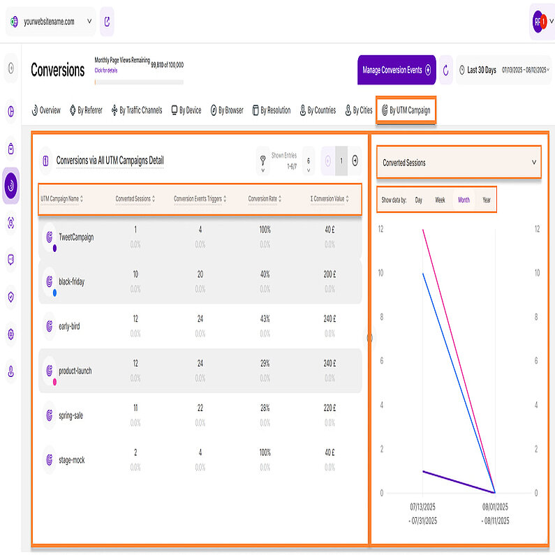
This report block shows you the overall amount of triggers of all the website's conversion events in a selected period of time sorted by UTM campaign. To help you analyze this data effectively, we offer a Split Table / Line Diagram visualization option.
The table on the left displays conversions from all UTM Campaigns and is organized into five columns.
- UTM Campaign Name: Shows all UTM campaigns that have forwarded sessions to the website which triggered at least one conversion event in the selected time period. Each UTM Campaign Name icon has a colored dot in the lower right corner to link the element visually with the line within the line diagram element on the right.
- Converted Sessions: This metric shows the number of website sessions that triggered a conversion event at least once in the selected period of time and are hence considered a converted session.
- Conversion Events Triggers: This column displays how many triggers of conversion events were generated by sessions visiting your website via a specific UTM campaign in the selected time period.
- Conversion Rate: The conversion rate shows you what percentage of all sessions that visited your website via a specific UTM campaign in a selected time period have triggered at least one conversion event.
- Σ Conversion Value: The total conversion value of a UTM campaign is calculated by multiplying the number of triggers of all conversion events generated via the sessions of a specific UTM campaign within the selected time period by their respective monetary conversion values.
Important Notes:
- Apply filters to refine your data. You can also customize the number of entries per page and use pagination to navigate through the results.
- Click any of the column headers to sort the data. By default, the table is sorted alphabetically by traffic channel.
- Resize the table and chart sections using the horizontal arrow icon.
- You can compare data by selecting one or more UTM Campaigns.
The line diagram on the right side displays data for the selected UTM Campaign. You can use the dropdown menu at the top right to choose which secondary metric to display.
We have four secondary metrics:
- Converted Sessions (default metric)
- Conversion Event Triggers
- Conversion Value
- Conversion Rate
Click any data point to view more details, including the date range, UTM Campaign name, and the value of the selected secondary metric.
You can also group the data by days, weeks, months, or years for a more detailed analysis.
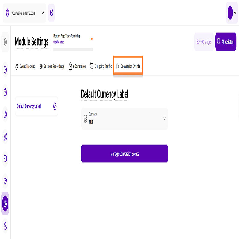
Within this section of the Module Settings, you can configure the default currency for all conversion events. A comprehensive guide on this topic is available in our Conversion Events Settings article.


