- Why Us?
- Features
White Label
For SaaS Platforms & Agencies
Provide our complete analytics suite to your clients, directly within your own interface and with your/their own branding. Discover Analytics-as-a-Service and White Label Analytics. Great benefit, minimal effort.
- Pricing
- White Label
- Success Stories
- Partner
- ResourcesExpand Your Knowledge
- First Steps Checklist
-
Frequently Asked Questions
-
All About Features
- How to Install the Tracking Code
-
User Guides
-
Integrating With Other Platforms
-
Legal, Data Privacy & Certificates
- TWAIA Addendum
- White Label Analytics
- Glossary
- Contact
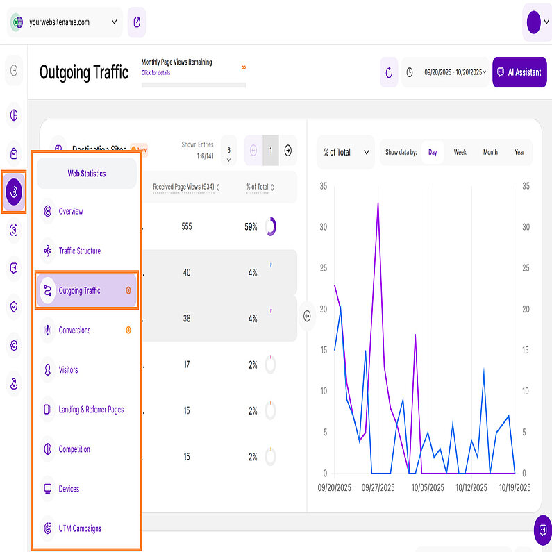
Outgoing Traffic
A Comprehensive View of Traffic Sources and Destinations
We’re excited to introduce a new addition to the Web Statistics module: Outgoing Traffic. This feature helps you see how many visitors are leaving your website to visit other sites, whether through links or new tabs.
To provide a clearer understanding of this feature, we've organized the article into the following sections:
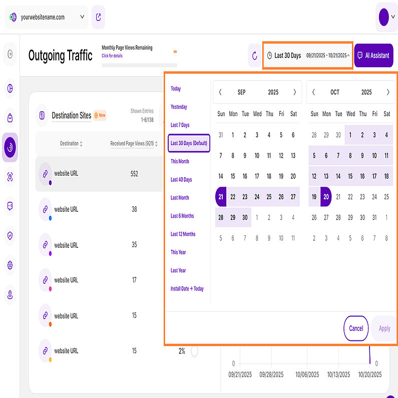
Right above the tiles, you can see a date picker. This enables you to select a certain time period or specific day to which you want the dashboard's data to correspond.
It is crucial to limit the presentation of data to specific dates or timeframes during which you executed potential campaigns or implemented other strategies. This will allow you to assess the effectiveness of these actions and use the insights gained for future planning.
Important Notes: The app now remembers previously set segments, filters, filter templates, and date intervals, even when you navigate away from the page, log out, or log back in. When your session expires or you close the tab, it automatically switches back to the default setting of "Last 30 Days."
- Make sure you have updated your app and tracking code with the latest version (replace the current tracking code with the fresh one recently released), so you can benefit from this feature.
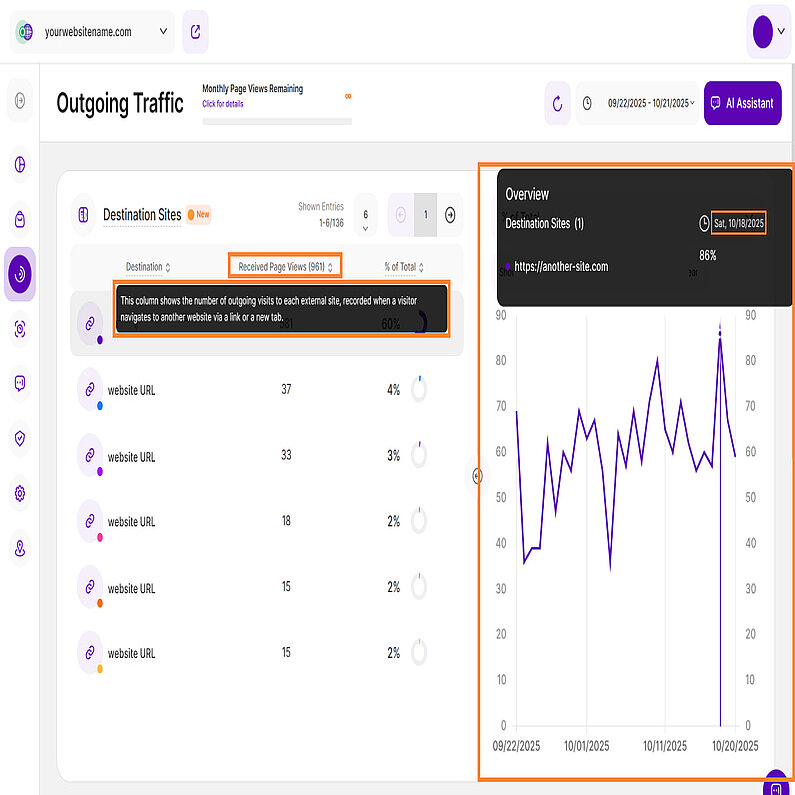
- A lot of elements contain descriptions if you hover over them. Just let your cursor run over various elements and discover how much data is actually packed into a tile.
- We've made accessing tooltips easier and less cluttered within the app. Here's how it works:
- Page header titles, RB titles, and Section headers: These tooltips now appear only when you click on the element itself.
- Tabs: The tooltip will be available by clicking only if the tab is currently active.
Hint: Look for a dashed underline on clickable elements to identify those with tooltips.
- Tooltips now display the abbreviated day of the week wherever dates are available. This will help you identify trends and analyze website traffic in relation to the days of the week.
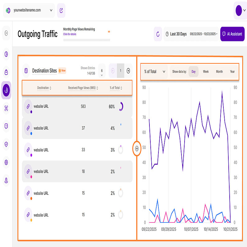
The Outgoing Traffic submodule is divided into two report blocks. The first is the Destination Websites report block that lists third-party websites that received visits or page views from your own website during the selected period. Visits are forwarded from your own website, for example, if it contains a link that redirects to a third-party website when clicked. Each click on such a link corresponds to a forwarded visit or an outgoing page view. The report also shows the number of received outgoing visits or page views of a 3rd party destination website as a percentage of your website's entire outgoing traffic.
The data is displayed using a Split Table / Line Diagram visualization. On the left, you will see the Destination Websitestable with the following columns:
- Destination Website:This column lists 3rd party websites to which your own website forwarded page views (e.g. if a visitor clicked on a link on your website forwarding to the third party website) within the selected period of time. Select an external website to view its historical data on the right side of the report block.Each destination is associated with a colored dot, displayed in the link icon.
- Received Page Views: This column shows the number of visits received by each external site listed. An outgoing visit is recorded when a visitor navigates to another website via clicking a respective link on your own website forwarding to it.
- % of Total: This column shows the number of received outgoing visits or page views of a 3rd party destination website as a percentage of your website's entire outgoing traffic.
These columns can be sorted by ascending or descending order. By default, the destination websites with the highest number of outgoing visits will be displayed first.
You can click on any row in the table to activate the corresponding line in the line diagram on the right. The line's color matches the little colored dot in the link icon on the left of the table.
Hint: You can only select a maximum of 7 lines at the same time (to make use of the 7 main colors). Selecting an 8th destination will deselect the first selected one.
Important Notes:
- Easily customize the number of entries per page and navigate through the data using the pagination buttons.
- Resize the table and chart sections using the horizontal arrow icon.
The right side of the report block features a Line Diagram to visualize trends for the destination websites you select from the left-hand table. Use the dropdown menu at the top of the chart to choose the secondary metric you wish to visualize.
You can choose between two secondary metrics: % of Total (selected by default) and Number of Received Page Views.
Customize your view by selecting one or more categories from the left table. You can select and deselect it to compare the data.
Click any data point to view more details, including the KPI count, the secondarymetric value (% of Total or Number of Received Page Views), and the dates for the selected time period.
For better analysis, the data can be grouped by days, weeks, months, or years within this chart.
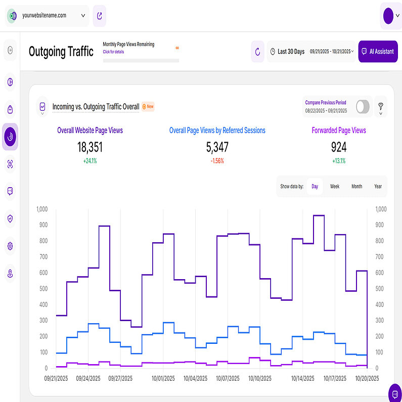
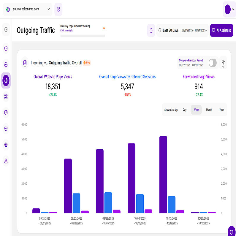
The Incoming vs. Outgoing Traffic Overall report block compares your website’s overall incoming traffic, the overall incoming traffic via referrals and the overall outgoing traffic within the selected time period.
Get to know more about the following Key Performance Indicators (KPIs):
- Overall Website Page Views: The total number of website page views recorded on your website.
- Overall Page Views by Referred Sessions: The total number of page views generated by all referred sessions on your website. This includes all page views from sessions originating from any traffic channel except "Direct".
- Forwarded Page Views: The total number of page views forwarded to external, third-party websites following a click on your own website.
You can choose how to visualize your data. By default, a line chart is used, with each KPI displayed as a line. You can also refine the chart by applying filters or by deselecting individual KPIs. Enable just the ones that you are interested in or maintain them all to get a more complete overview.
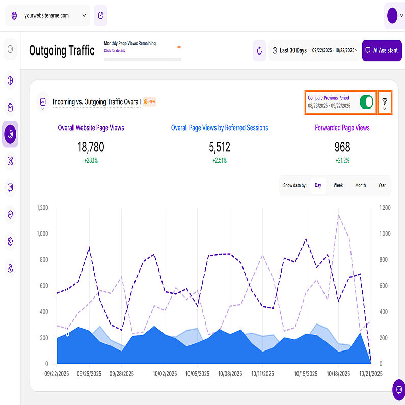
At the top right of this report block, you’ll find the Compare radio button that enables the following data comparison options:
- Compare Previous Period: Compares the current data to the previous period (if it exists).
- Compare Year over Year: Compares the current data to the same period of the previous year(if it exists).
The report defaults to comparing your current data to the previous period. Click the option to switch to a Year over Year comparison. You can now compare your current data to the previous period or compare it year over year. You’ll also find the dates covered by the previous period or year, for example, 11/09/2024 - 12/09/2024. This enables you to get a better view of your current data compared to the previous equivalent period or year. The lines in lighter shades represent the data from the previous time period.
Important Hints:
- Make sure the desired time period is selected, so that the data matches what you want to see. The default is Last 30 Days. Note: The system retains the last filter/date interval selected, even after logout and a new login.
- Each metric also has a percentage beneath it, which represents a comparison with the previous equivalent period. They can be:
Green ( You’re on track! ): The data presented has improved in comparison to the previous period.
Red ( You have work to do! ): The data presented has worsened in comparison to the previous period.
This color scheme allows you to see whether your website is on a good track or not – if all or most of your KPIs are green, things are working out as they should. If all or most of them are red, you should take action. - Just below the KPIs, you are given the option to group the data by Day, Week, Month, or Year intervals. Report blocks with weekly, monthly, and yearly data now clearly display both start and end dates for each period to improve readability. To get more detailed information, hover your cursor over each data point.
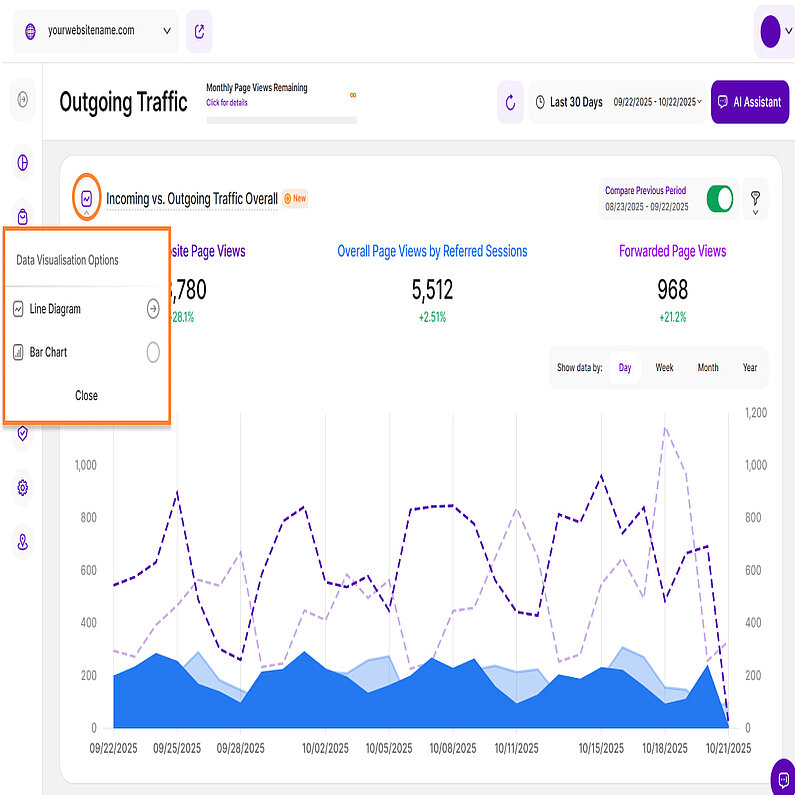
The Incoming vs. Outgoing Traffic Overall report block provides flexible data visualization options. Choose between bar charts and line diagrams to easily identify trends and patterns.
Customize your view with the following visualization options:
- Line Diagram View
- Bar Chart
Line diagrams serve as the backbone of data visualization, adept at illustrating trends and patterns over time. Picture a series of data points resembling stepping stones across a river; a line chart connects these points, forming a visual bridge that unveils the trajectory of your data journey.
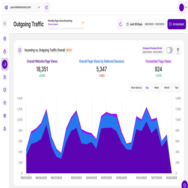
We have three types of visualization options for Line Diagram View and the first one is the Line Diagram. These are commonly known as line charts, are ideal for visualizing trends over time. By connecting data points with a line, they clearly show how KPIs like website traffic and outgoing traffic evolve.
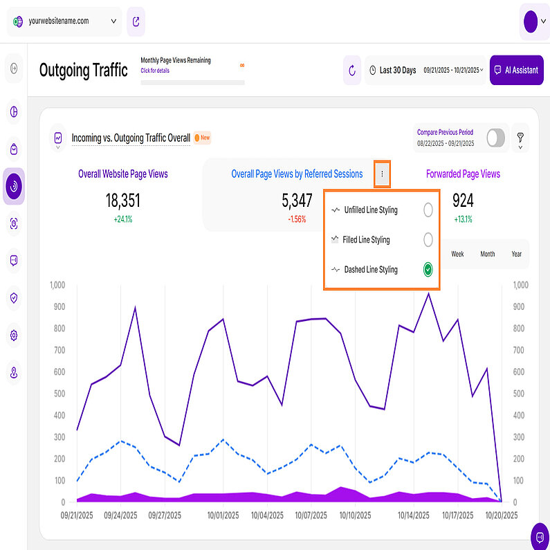
To customize the appearance of each line, click the three-dot icon next to the KPI and choose from the following styling options:
- Unfilled Line Styling
- Filled Line Styling
- Dashed Line Styling
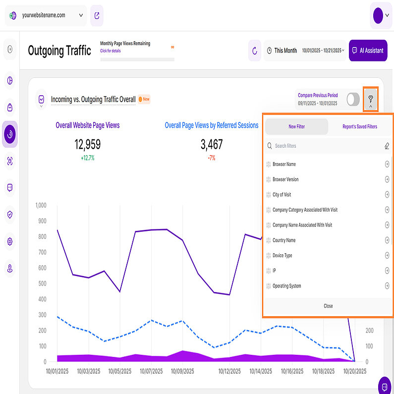
The Incoming vs. Outgoing Traffic Overall report blocks now offer enhanced filtering capabilities to refine your traffic analysis. Use one or multiple filters simultaneously to precisely segment your data and drill down into specific insights.
We've enhanced the Traffic Channel filter set within this report block with the addition of the AI Traffic filter. This new filter isolates referrals from major generative engines (like ChatGPT, Google Gemini, and Perplexity), allowing you to precisely track visitor volume and gain clear insight into how these new sources impact your site's engagement.
The following filters are available:
| Filter Category | What It Filters and Why |
| Browser Name | Analyze traffic based on the browser used (e.g., Chrome, Safari). Use this to optimize your website experience based on audience preference. |
| Browser Version | Identify issues or prioritize fixes by filtering data related to specific browser versions. |
| City of Visit | Drill down into visitor location data even further by using this filter. |
| Company Category Associated With Visit | B2B businesses can identify which industries are visiting your site and inform lead generation strategies. |
| Company Name Associated With Visit | Segment and organize visitor data by specific organizations, providing valuable insight into interested companies. |
| Country Name | Filter by country to analyze traffic by geo-location. |
| Device Type | Understand and optimize overall traffic based on the visitor's device (desktop, mobile, tablet). |
| IP | A valuable filter for tracking visits from specific IP addresses, such as internal visitors or high-value potential clients. |
| Operating System | Ensure optimal performance across different operating systems (OS). |
| Page URL | Analyze traffic behavior for specific pages on your site. |
| Referrer URL | See which specific page on an external site sent traffic to your website. |
| Screen Resolution | This filter is essential for optimizing your website's layout and design based on your traffic analysis. |
| Traffic Channel | Segment traffic by its origin (e.g., Organic Search, Social Media, AI Traffic). |
| UTM Campaign Filter | Track the performance of specific marketing campaigns. |
How to Filter Data
- Apply a Filter: Click the filter icon, choose your filter, specify criteria, and click Submit.
- Save a Template: Click Save set filters for report block, name the template, and click Save Changes.
- Use a Template: Click the filter icon, go to the Report’s Saved Filters tab, select the template, and click Submit.
- Manage Templates: Click the pencil icon next to the template to rename it or select Delete Template (confirmation required).


