- Why Us?
- Features
White Label
For SaaS Platforms & Agencies
Provide our complete analytics suite to your clients, directly within your own interface and with your/their own branding. Discover Analytics-as-a-Service and White Label Analytics. Great benefit, minimal effort.
- Pricing
- White Label
- Success Stories
- Partner
- ResourcesExpand Your Knowledge
- First Steps Checklist
-
Frequently Asked Questions
-
All About Features
- How to Install the Tracking Code
-
User Guides
-
Integrating With Other Platforms
-
Legal, Data Privacy & Certificates
- TWAIA Addendum
- White Label Analytics
- Glossary
- Contact
Visitors Feature
5 Sections That Tell You Almost Everything You Need to Know
The Visitors feature within the Web Statistics module delivers almost all the data you need about your website visitors. This detailed visitor information is crucial, as consistent traffic is the foundational element for client acquisition and business success.
This module is neatly organized into five insightful sections:
Set the Date
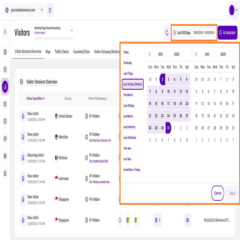
Right above the tiles, you can see a date picker. This enables you to select a certain time period, or specific day, for which you want the Dashboard's data to correspond.
It is crucial to limit the presentation of data to specific dates or timeframes during which you executed potential campaigns or implemented other strategies. This will allow you to assess the effectiveness of these actions and use the insights gained for future planning.
These tips will help you discover hidden information and get the most out of this module to analyze your visitor data:
- Hover Functionality: Simply move your mouse over certain elements to instantly view more information.
- Tooltips: You can access the tooltips containing descriptions, important hints, and links to the glossary by clicking on Page header titles, Report Block (RB) titles, and Section headers. For tabs, the tooltip is available only if the tab is currently active. Hint: Look for a dashed underline on clickable elements to identify those with tooltips.
- Refresh Button: Located in the upper right corner next to the date picker. A single click will refresh the data on the report block without reloading the entire page.
- AI Assistant Button: Our new assistant, TWAIA, is located in the top right corner of all modules. This gives you easy, one-click access to assistance whenever you need it.
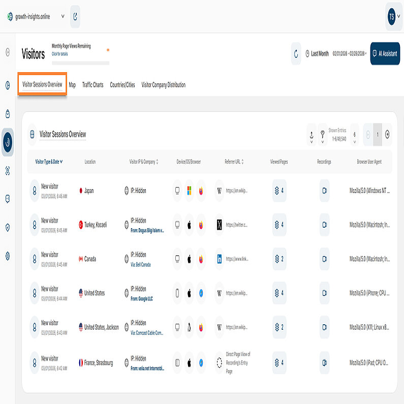
This report block lists all website visitor sessions for your selected time period. It highlights whether each visitor session is new, returning, or converting — and visitor sessions can appear as both 'new & converting' or 'returning & converting' if applicable.
Each row represents a visitor session and displays the following information:
- Visitor Type & Date: Displays the visitor type along with the complete date and time of visit. Hint: Click the user icon to view the visitor's history (availability is dependent on privacy settings). Below are the visitor types available:
- New visitor session: Has not visited your website before.
- Returning visitor session: Has already visited your website at least once before.
- Converting Visitor session: Triggered an event which you defined as a conversion event in your website settings.
- Location: Displays the flag, country, and city of the visitor. Hovering over the flag reveals a location icon, and clicking it directs you to the map view.
- Visitor IP & Company: Displays the unique IP address. You can now easily sort this column by clicking the column header. Choose ascending or descending order. Hint:The Company Reveal feature is available if you are subscribed to the minimum pricing plan. This feature analyzes IP addresses against company-owned ranges: if a match is found, the Company name is displayed; otherwise, only the Internet Service Provider (ISP) is shown. Hover over the company name or ISP to reveal the overall count of page views originating from this IP within the selected time period.
- Device/OS/Browser: Displays the technical specifications, including the type of device (mobile, tablet, desktop), operating system (Windows, Android, iOS, etc.), and browser (i.e. Chrome, Safari, Internet Explorer, Firefox, etc.) used. Hover over the icons to see more information.
- Referrer URL: Displays the source URL from which the visitor reached your website. The column can be sorted alphabetically for easier data analysis.
- Viewed Pages: Displays the total number of pages viewed by this visitor during this session. Hover over the icon to see a list of the visited pages (newest first), including the page title, URL, and the visiting date & time. Click the link to view the visited page.
- Recordings: Indicates whether a session recording was created for the session. Click the icon to view the recording and session details.
- Browser User Agent: Displays the specific string that a web browser sends to a server. Essentially, the User Agent provides the server with information about the visitor’s browser, version, and operating system to help the website deliver optimized content and compatibility. It is also crucial for identifying and tracking bots and web crawlers (like Googlebot) to manage crawling and site access, which is a key part of SEO and security.
In the upper right of the report block, you'll find the primary data controls:
- Export Icon: Allows you to download the report data as .CSV or .XLSX files. The exported file is delivered to your email, and you can review past requests in the Emailed Export History section.
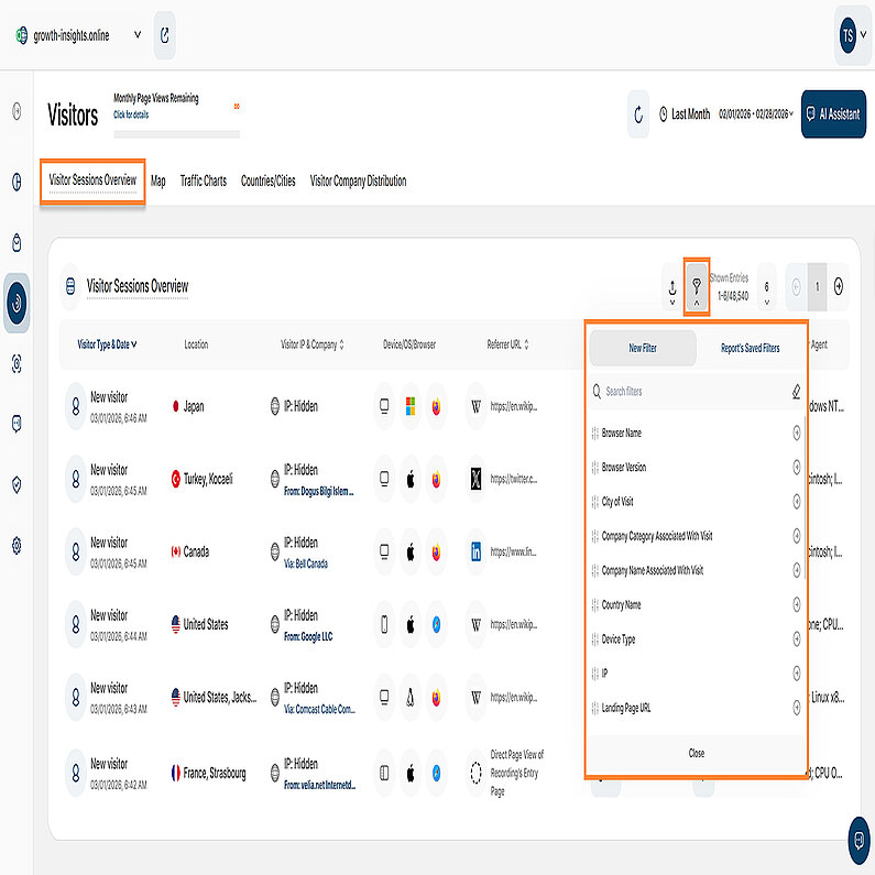
- Filter Icon: Allows you to apply various filters for a more focused analysis of visitor data.
- Pagination: Customize your view by adjusting the number of entries shown per page. Use the pagination buttons to quickly move backward or forward through the data set.
Important Note: The data presented in this report block is dependent on the data privacy mode you have chosen for your website.
The Visitor Sessions Overview report block now features expanded filtering capabilities designed to empower you with greater control and deliver truly deeper insights. You can apply a wide range of filters, individually or in combination, and easily save these powerful configurations as custom templates for subsequent use.
We've enhanced the Traffic Channel filter set within the Visitors submodule with the addition of the AI Traffic filter. This new filter isolates referrals from major generative engines (like ChatGPT, Google Gemini, and Perplexity), allowing you to precisely track visitor volume and gain clear insight into how these new sources impact your site's engagement.
These filters are also available on the Latest Visitors Map and the Visitor Company Distribution report blocks.
You can find a complete list of the available filters below:
| Filter Category | What It Filters and Why |
| Browser Name | Filters visitors by the specific web browser they used and helps you optimize your website based on your audience's preferred viewing environment. |
| Browser Version | Filters visitors by the specific browser version. This is essential for identifying compatibility issues and prioritizing necessary fixes. |
| City of Visit | Provides granular segmentation of visitors based on their city location. Crucial for local businesses tailoring content and marketing strategies geographically. |
| Company Category Associated With Visit | Filters business (B2B) visitors by their industry category. Informs lead generation and personalized outreach by identifying high-interest industries. |
| Company Name Associated With Visit | Pinpoints visitors belonging to a specific company name (B2B). Helps analyze data by industry and identify which specific companies show the most interest. |
| Country Name | This filter segments visitor data based on their country of origin, allowing global businesses to explore visitor behavior, aid in localization efforts, and refine targeting strategies. |
| Device Type | This filter classifies visitors by Device Type (Desktop, Mobile, Tablet), which is crucial for ensuring responsiveness and a visitor-friendly experience across all primary access points. |
| IP | Filters visitors by specific IP addresses, making it valuable for tracking activity from internal teams, partners, or specific potential clients. |
| Landing Page URL | Filters visitors based on the specific URL of the page where they entered the site. It helps in assessing content effectiveness by seeing which entry points attract new traffic and drive specific visitor behavior. |
| Operating System | Identifies visitors based on their OS (Windows, macOS, Android). This information is used to fine-tune website performance and resolve platform-specific compatibility issues. |
| Page URL | Narrows down data to specific page URLs. Invaluable for identifying which exact pages are driving the most engagement or conversion and require optimization. |
| Referrer URL | Reveals the exact external website driving visitors to your site (inbound traffic source). Helps you understand which external channels are successfully delivering your audience. |
| Screen Resolution | Filters visitors based on their screen size/resolution. Essential for optimizing your website's layout and design to ensure a stunning and correct appearance on all screens. |
| Traffic Channel | Classifies visitors based on the origin source (e.g., Organic Search, Paid Ads, Direct). Vital for allocating resources effectively and strategically refining overarching marketing campaigns. |
| User Agent | Filters visitors by the browser, operating system, and device information contained within the User Agent string. Helps in optimizing technical performance and design priorities (especially mobile responsiveness) based on audience device preference. Also aids in bots and web crawlers detection. |
| UTM Campaign Filter | Filters data by specific marketing campaign parameters. Allows you to easily track and see exactly how each individual campaign is performing. |
| Visitor Type | Differentiates between New and Returning Visitors. Helps you measure audience loyalty and assess the effectiveness of both acquisition and retention strategies. |
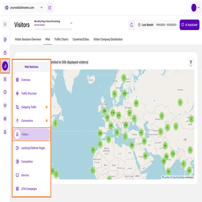
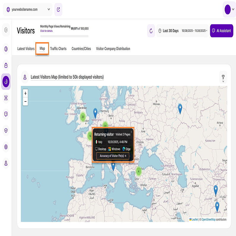
The Latest Visitors Map shows you where the traffic on your website is actually originating from. It enables you to see right from the start whether there is a strong tendency of visitors coming from a certain continent, country, region or even city.
Geo-location plays an important role in improving the performance of your website, as it allows you to check whether you should optimize your campaigns or content for certain cultural needs, languages, time-zones, etc. – depending whether you want to get even more traffic from this region or start to receive visitors at all.
Green bubbles on the map represent visitor clusters from specific regions, where the number inside shows the visitor count. Single blue "location" pins mark individual visitors. To see more precise visitor information, you can explore regions by clicking on the green bubbles to expand them, or use the '+' and '-' buttons in the top right corner of the map to zoom in and out.
When you click on a blue pin, a tooltip appears showing detailed information about that visitor:
- Visitor Type: Identifies the visitor as New, Returning or Converting.
- Number of Pages visited: The count of pages visited. Click the link to view the Visitor History.
- Country: Shows the country flag and name.
- Last Session: The exact date and time of the last visit.
- Device Type: Indicates the device used (Desktop, Phone, or Tablet).
- Operating System: Specifies the OS (Windows, macOS, Linux, Android, etc.).
- Browser: Specifies the browser used (Chrome, Safari, Firefox, Edge, Opera, etc.).
To learn about location tracking accuracy, please locate the Accuracy of Visitor Pin(s) link at the bottom of each tooltip. Clicking this link will redirect you to a resource page detailing GeoIP accuracy comparisons for global locations, which explains our tracking methodology and its limitations.
The location accuracy is based on the IP-address registration. Each IP is registered and provided by the service that assigned it. While complying with the privacy laws and policies, the location is displayed somewhere in an X mile radius every time (e.g. city, or even neighborhood).
To optimize performance, we’ve set a limit of 50,000 visitors that can be displayed at once. If there are more than that during the time period you've selected, we'll show you the most recent ones until the limit is reached.
Important Note: Location pins will be displayed for all privacy settings except when Maximum Privacy mode is activated.
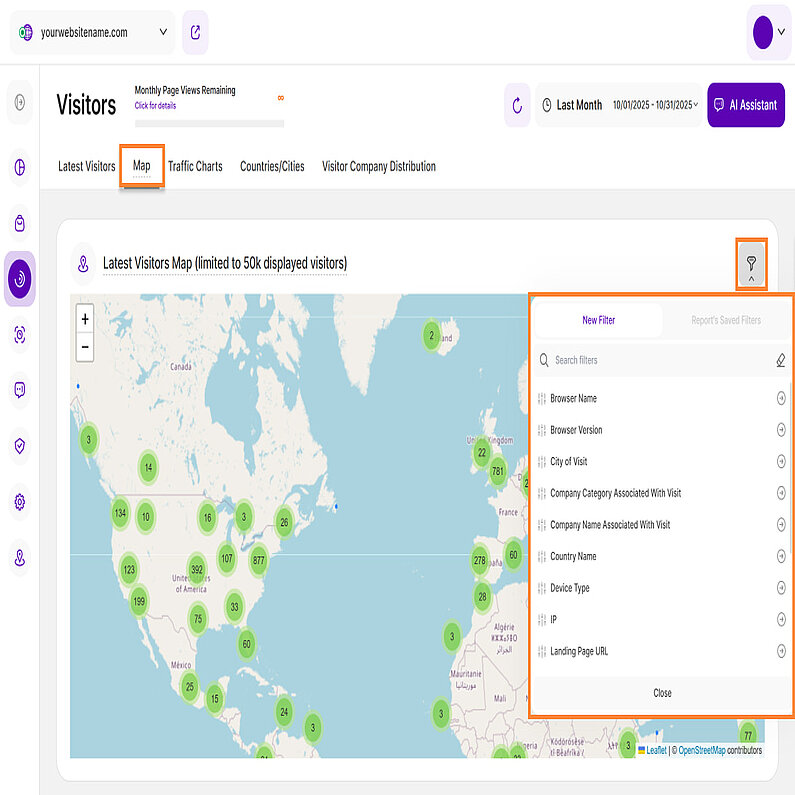
The Latest Visitors Map now offers multiple filter options that you can use individually or in combination to refine data and focus your analysis on specific geographic regions.
To see what filters you can apply to the map data, check the complete list below:
| Filter Category | What It Filters and Why |
| Browser Name | Filters visitors by the specific web browser they used and helps you optimize your website based on your audience's preferred viewing environment. |
| Browser Version | Filters visitors by the specific browser version. This is essential for identifying compatibility issues and prioritizing necessary fixes. |
| City of Visit | Provides granular segmentation of visitors based on their city location. Crucial for local businesses tailoring content and marketing strategies geographically. |
| Company Category Associated With Visit | Filters business (B2B) visitors by their industry category. Informs lead generation and personalized outreach by identifying high-interest industries. |
| Company Name Associated With Visit | Pinpoints visitors belonging to a specific company name (B2B). Helps analyze data by industry and identify which specific companies show the most interest. |
| Country Name | This filter segments visitor data based on their country of origin, allowing global businesses to explore visitor behavior, aid in localization efforts, and refine targeting strategies. |
| Device Type | This filter classifies visitors by Device Type (Desktop, Mobile, Tablet), which is crucial for ensuring responsiveness and a visitor-friendly experience across all primary access points. |
| IP | Filters visitors by specific IP addresses, making it valuable for tracking activity from internal teams, partners, or specific potential clients. |
| Landing Page URL | Filters visitors based on the specific URL of the page where they entered the site. It helps in assessing content effectiveness by seeing which entry points attract new traffic and drive specific visitor behavior. |
| Operating System | Identifies visitors based on their OS (Windows, macOS, Android). This information is used to fine-tune website performance and resolve platform-specific compatibility issues. |
| Page URL | Narrows down data to specific page URLs. Invaluable for identifying which exact pages are driving the most engagement or conversion and require optimization. |
| Referrer URL | Reveals the exact external website driving visitors to your site (inbound traffic source). Helps you understand which external channels are successfully delivering your audience. |
| Screen Resolution | Filters visitors based on their screen size/resolution. Essential for optimizing your website's layout and design to ensure a stunning and correct appearance on all screens. |
| Traffic Channel | Classifies visitors based on the origin source (e.g., Organic Search, Paid Ads, AI Traffic). Vital for allocating resources effectively and strategically refining overarching marketing campaigns. |
| User Agent | Filters visitors by the browser, operating system, and device information contained within the User Agent string. Helps in optimizing technical performance and design priorities (especially mobile responsiveness) based on audience device preference. Also aids in bots and web crawlers detection. |
| UTM Campaign Filter | Filters data by specific marketing campaign parameters. Allows you to easily track and see exactly how each individual campaign is performing. |
| Visitor Type | Differentiates between New and Returning Visitors. Helps you measure audience loyalty and assess the effectiveness of both acquisition and retention strategies. |
Traffic Charts
If you want to check additional data in regards to the timewise distribution of your website’s traffic, this is the correct view to open.
Important Hints:
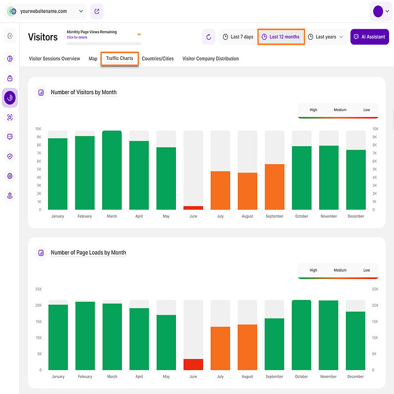
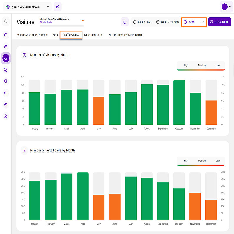
- All charts display the amount of visitors on the vertical y-axis. The scale is always calculated automatically for you.
- The bars within the charts have 3 different colours:
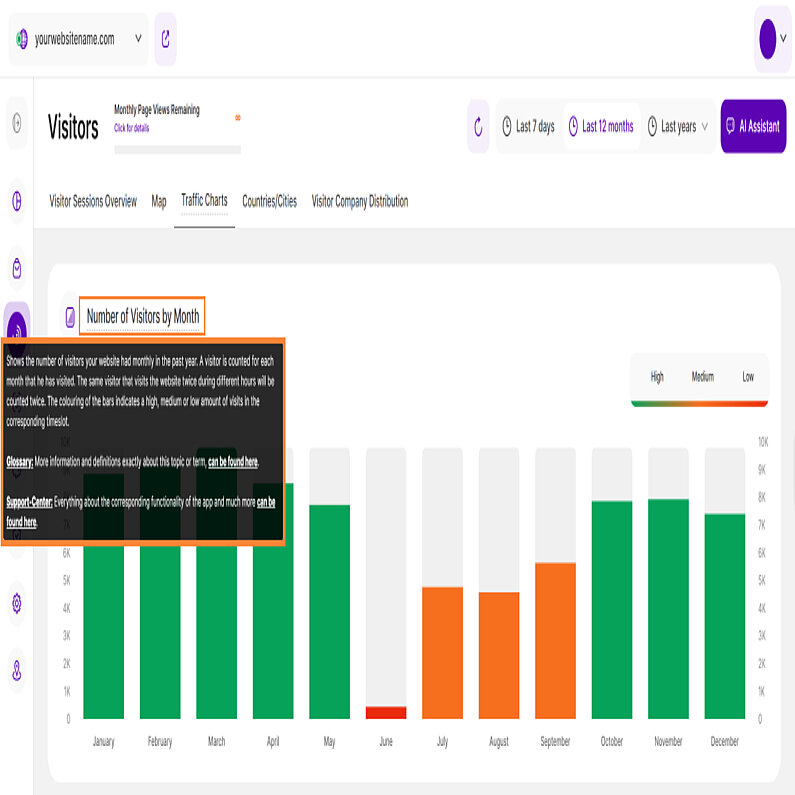
- Green: Stands for “High traffic” compared to your average traffic overall. It marks the hours, days, weeks with a high traffic amount on your website.
- Orange: Stands for “Medium traffic” compared to your average traffic overall. It marks the hours, days, weeks with a medium traffic amount on your website.
- Red: Stands for “Low traffic” compared to your average traffic overall. It marks the hours, days, weeks with a low traffic amount on your website.
- The displayed charts depend on your selected time range in the top bar: Last 7 days, Last 12 months, or Last years.
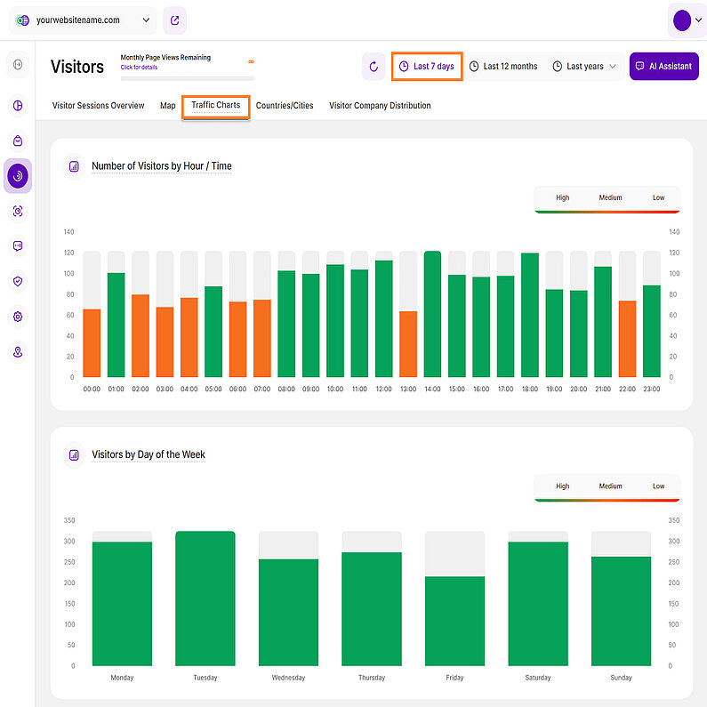
In the "Last 7 days" time range, this tab displays four graphs. The first two graphs focus on the number of visitors:
- Number of Visitors by Hour / Time: This graph shows how your traffic is distributed on an hourly scale based on the selected time range. It helps you determine whether your visitors typically browse your page in the morning, afternoon, night or at other times of the day.
- Number of Visitors by Week Days: This graph shows how your traffic is distributed across different days of the week based on the selected time range. It determines whether your visitors tend to browse your page mostly on Mondays, Fridays, mid-week, or weekends. It also helps you identify the days with low traffic volumes.
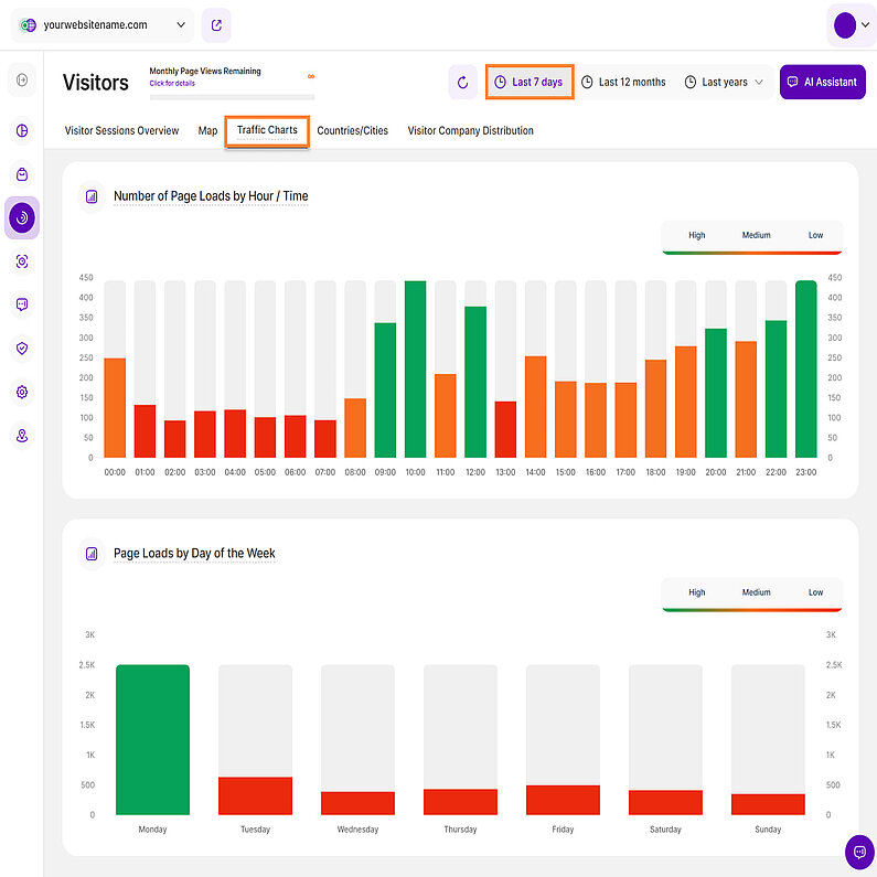
The last two graphs show the number of page loads:
- Number of Page Loads by Hour / Time: This graph presents the distribution of page loads on an hourly scale, based on the selected time range. It allows you to understand at what times of the day your website experiences the highest and lowest page loads. This supports the data shown in the "Number of Visitors by Hour / Time" graph.
- Number of Page Loads by Week Days: This graph illustrates the distribution of page loads across the days of the week, using the selected time range. It provides insights into which days experience more page loads and helps you identify any patterns or trends in page load activity throughout the week, supporting the data shown in the "Number of Visitors by Week Days" graph.
- Number of Visitors by Month: Just as you have the average traffic distribution by hour and weekday, this chart gives you an overview of the average distribution throughout the past 12 months. A visitor is counted for each month that he has visited. The same visitor that visits the website twice during different hours will be counted twice. Noticing seasonal traffic increases/decreases on your website will further help you to understand your visitor base and how you can target them better.
- Number of Page Loads by Month: Shows the number of page views your website had monthly in the past year. This supports the data of the graph "Number of Visitors by Month".
- Number of Visitors by Month: Shows the number of visitors your website had monthly in the selected year. A visitor is counted for each month that he has visited. The same visitor that visits the website twice during different hours will be counted twice. The colouring of the bars indicates a high, medium or low amount of visits in the corresponding timeslot.
- Number of Page Loads by Month: Shows the number of page views your website had monthly in the selected year. This supports the data of the graph "Number of Visitors by Month".
Important Hints:
- The data from the charts above can support you with many different topics, i.e. in planning your campaigns or timing updates/downtime of your website.
- Check these charts regularly to always be up to date when it comes to planning your marketing/technical measures. This will support you strongly in generating maximum success of your launched campaigns.
Countries/Cities
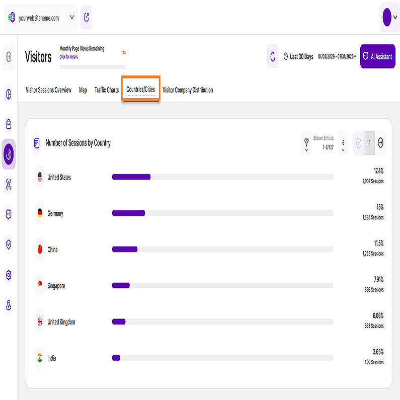
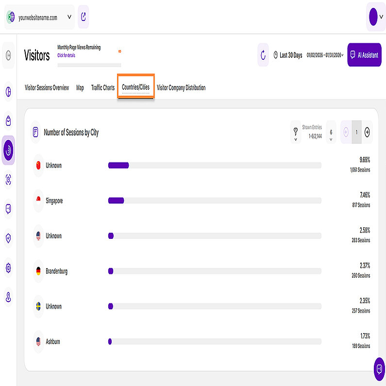
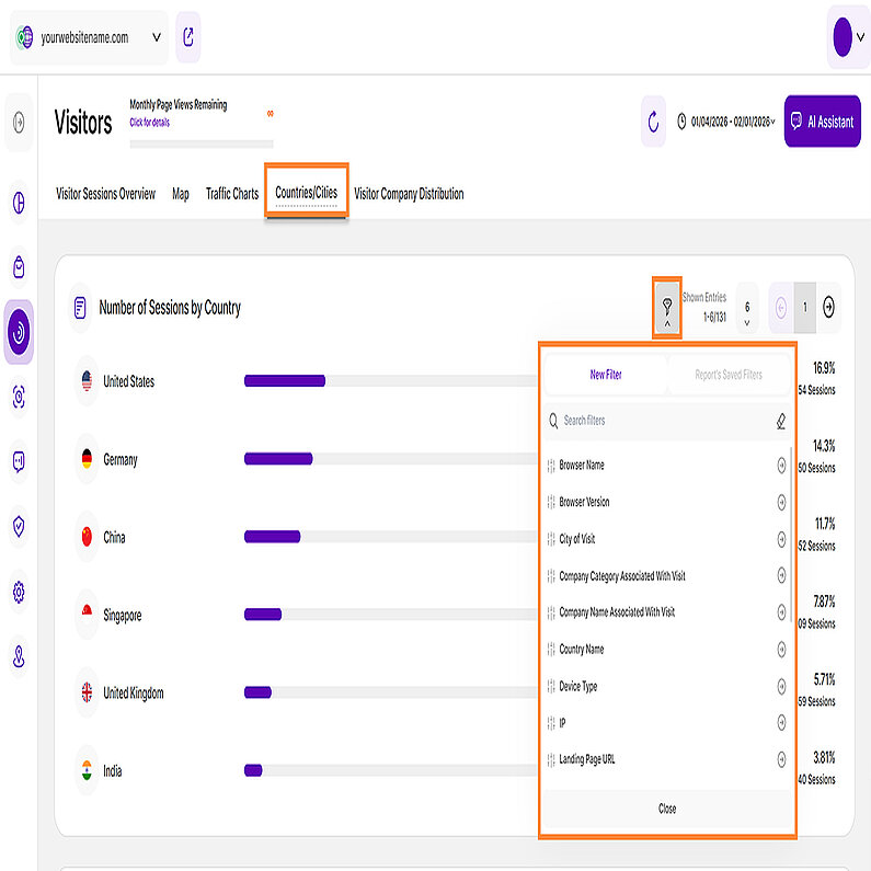
The Countries/Cities tab acts as an extension of the map view. It consists of two report blocks that display all the countries and cities generating traffic for your website. The report automatically ranks countries and cities by the number of sessions, allowing you to identify your highest-performing markets at a glance.
The first report block provides a comprehensive overview of your visitors origin by country, allowing you to analyze your traffic patterns by location more effectively for your selected time period.
Here’s a detailed breakdown of the information presented in this report block:
- Country: Each row represents a specific country identified as a source of website visits. The accompanying bar provides a visual representation of the number of sessions.
- Percentage: The percentage shown next to each bar indicates the proportion of total sessions attributed to that country. This helps you gauge the relative contribution of each location to your overall web traffic.
- Total Number of Sessions: Located below the percentage, the total number of sessions for that specific country is displayed for exact tracking.
To further refine your insights, use the filter option to narrow down the data for a more focused analysis. You can also customize your view by adjusting the number of entries shown per page. Use the pagination buttons to quickly move backward or forward through the data set, or jump directly to a specific page to find the information you need.
The second report block lists visitor cities for the selected period, providing granular performance data at the city level.
Here’s a detailed breakdown of the information presented in this report block:
- City: Each row represents a specific city identified as the source of website visits. The accompanying bar provides a visual representation of the number of sessions.
- Percentage: The percentage shown next to each bar indicates the proportion of total website sessions attributed to that particular city. This helps you understand the relative contribution of each city to your overall web traffic.
- Total Number of Sessions: Below the percentage, the total number of sessions for that specific city is displayed.
To get the most out of your data, use the filter tool to narrow your results for a more targeted review. You can also tailor your view by changing the number of entries displayed per page. Use the pagination controls to navigate through the data set or jump to a specific page to find the exact details you need.
The report blocks under Countries/Cities support advanced filtering, allowing users to apply multiple criteria concurrently. By combining filters, you can isolate specific geographic datasets and gain precise insights into trends across your selected locations.
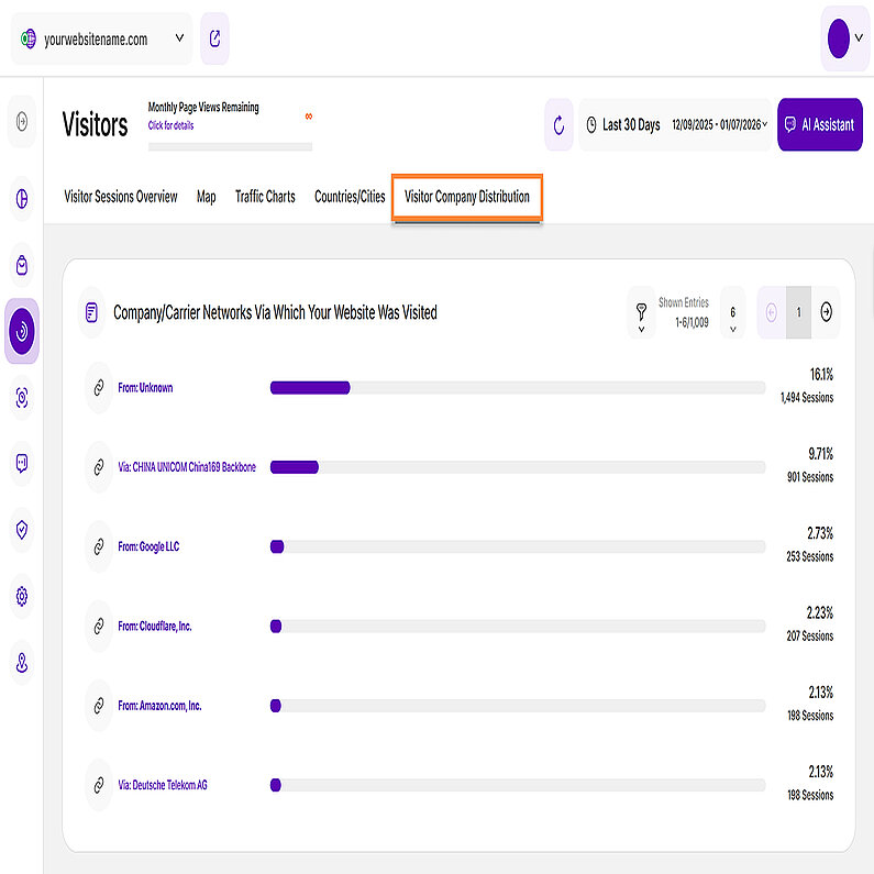
As part of the Company Reveal feature, the Visitor Company Distribution tab provides valuable statistics and insights into the companies or carrier networks that contribute the most to the overall traffic on your website based on the selected time period.
The list highlights the companies or carrier networks that have contributed the most to your website's traffic, sorted with the highest percentage first. Understanding this distribution can help you assess the effectiveness of your marketing efforts, identify potential business partners or customers, and gain insights into the geographical reach of your website's audience.
The data is presented in a horizontal bar chart view, containing the following details:
- Company or Carrier Network: Each bar in the chart represents a specific company or carrier network that has been identified as the source of website visits.
- Percentage:The value next to each bar shows the percentage of total website sessions attributed to that entity, clarifying its share of your overall web traffic.
- Total Number of Sessions:Displayed below the percentage, this number shows the total sessions attributed to each organization or carrier network, clarifying the volume of traffic from that entity.
Important Notes:
- A minimum pricing plan must be purchased to use this feature. Otherwise, if you are not subscribed to the required plan, only "Reveal Company Name" will be shown. Tapping it displays a tooltip detailing the required plan, your current plan, and the Upgrade Plan button.
- Apply various filters for a more focused data analysis. To customize your view, adjust the number of entries shown per page and use the pagination buttons to quickly move backward or forward through the data set.
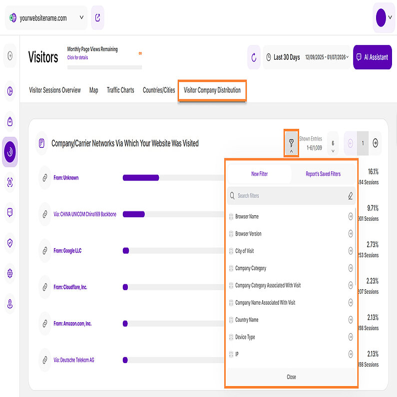
To quickly find information about a specific company, locate the filter icon in the top right corner of this report block. By selecting company-specific filters (such as Company Name or Company Category), you can streamline your analysis to focus exclusively on the engagement, technical environment, and behavior of your target B2B prospects.
You can filter your data using the following list of options:
| Filter Category | What It Filters and Why |
| Browser Name | Filters visitors by the specific web browser they used and helps identify if the company uses specific enterprise-mandated browsers that may lead to app compatibility issues or technical errors. |
| Browser Version | Filters visitors by the specific web browser they used and helps identify if the company uses outdated browsers that may lead to app compatibility issues or technical errors. |
| City of Visit | Provides granular segmentation of visitors based on their city location. Confirms whether the visiting companies are located within your service area or target sales territories, which is crucial for B2B strategy and regional compliance. |
| Company Category | This filter segments data by company type using two parameters: From (traffic originating directly from a company) and Via (traffic that passed through a company proxy or network). |
| Company Category Associated With Visit | Filters business (B2B) visitors by their industry category. Informs lead generation and personalized outreach by identifying high-interest industries. |
| Company Name Associated With Visit | Pinpoints visitors belonging to a specific company name (B2B). Helps analyze data by industry and identify which specific companies show the most interest. |
| Country Name | Provides granular segmentation of visitors based on their country. Confirms whether the visiting companies are located within your service area or target sales territories, which is crucial for B2B strategy and regional compliance. |
| Device Type | This filter classifies visitors by Device Type (Desktop, Mobile, Tablet), which reveals the work environment (e.g., are employees doing quick research on mobile, or in-depth analysis on desktop?). |
| IP | Filters visitors by specific IP addresses, making it valuable for tracking activity from internal teams, partners, or specific potential clients. |
| Landing Page URL | Filters visitors based on the specific URL of the page where they entered the site. It helps in assessing content effectiveness by seeing which entry points attract new traffic and drive specific visitor behavior. |
| Operating System | Identifies visitors based on their OS (Windows, macOS, Android). This information is used to fine-tune website performance and resolve platform-specific compatibility issues. |
| Page URL | Narrows down data to specific page URLs. Invaluable for identifying which exact pages are driving the most engagement or conversion and require optimization. |
| Referrer URL | Reveals the exact external website driving visitors to your site (inbound traffic source). Identifies high-value acquisition sources; shows where visitors or companies go for research or comparison before landing on your site. |
| Screen Resolution | Filters visitors based on their screen size/resolution. Ensures your UI is optimized for common corporate setups. |
| Traffic Channel | Classifies visitors based on the traffic source such as Direct Visit, Email and AI Traffic. It is is essential for qualifying inbound leads, as it helps you pinpoint which channels are most effective at driving high-quality traffic from desirable sources, including specific company visits. |
| User Agent | Filters visitors by the browser, operating system, and device information contained within the User Agent string. Helps in optimizing technical performance and design priorities (especially mobile responsiveness) based on audience device preference. Also aids in bots and web crawlers detection. |
| UTM Campaign Filter | Filters data by specific marketing campaign parameters. Allows precise measurement of which specific B2B ads, emails, or content pieces attracted high-value companies. |
| Visitor Type | Differentiates between New and Returning Visitors. Essential for B2B sales cycles; tracks whether key company visits are initial research or sustained interest over time. |
How to Filter Data
- Apply a Filter: Click the filter icon, choose your filter, specify criteria, and click Submit.
- Save a Template: Click Save set filters for report block, name the template, and click Save Changes.
- Use a Template: Click the filter icon, go to the Report’s Saved Filters tab, select the template, and click Submit.
- Manage Templates: Click the pencil icon next to the template to rename it or select Delete Template (confirmation required).


