






UX Health Score & Friction Monitoring
See where visitors get stuck. Know how bad it is.
UX Health Score & Friction Monitoring watches every page view for the moments a visitor expected something to happen and nothing did. Rage clicks, dead clicks, U-turns, panicked reloads. Counted automatically, distilled into one score, and one click from the recording.
ANALYZEUX Health Score & Friction Monitoring is one of five Analyze tools. → Explore them all
UX HEALTH SCORE
The number to check on Monday morning.
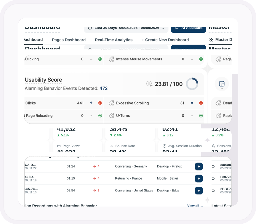
Your UX Health Score, shown as the Usability Score on your Master Dashboard, is the share of page views where nobody rage clicked, dead clicked, U-turned or reloaded in frustration. Out of 100, recalculated from every page view. Underneath it, six frustration signals, each with its count, its trend and a red or green light. Green means nobody hit that problem. Red means someone did, and the recording is a click away.
- One score out of 100 for your entire website, on your Master Dashboard
- Calculated from every page view: the share where no frustration signal fired
- Six signals underneath, each with a count, a trend line and a red or green indicator
- Watch the score move after every fix, so you know which ones worked
ALARMING BEHAVIOR EVENTS
Every dead click is a conversion that didn't happen.
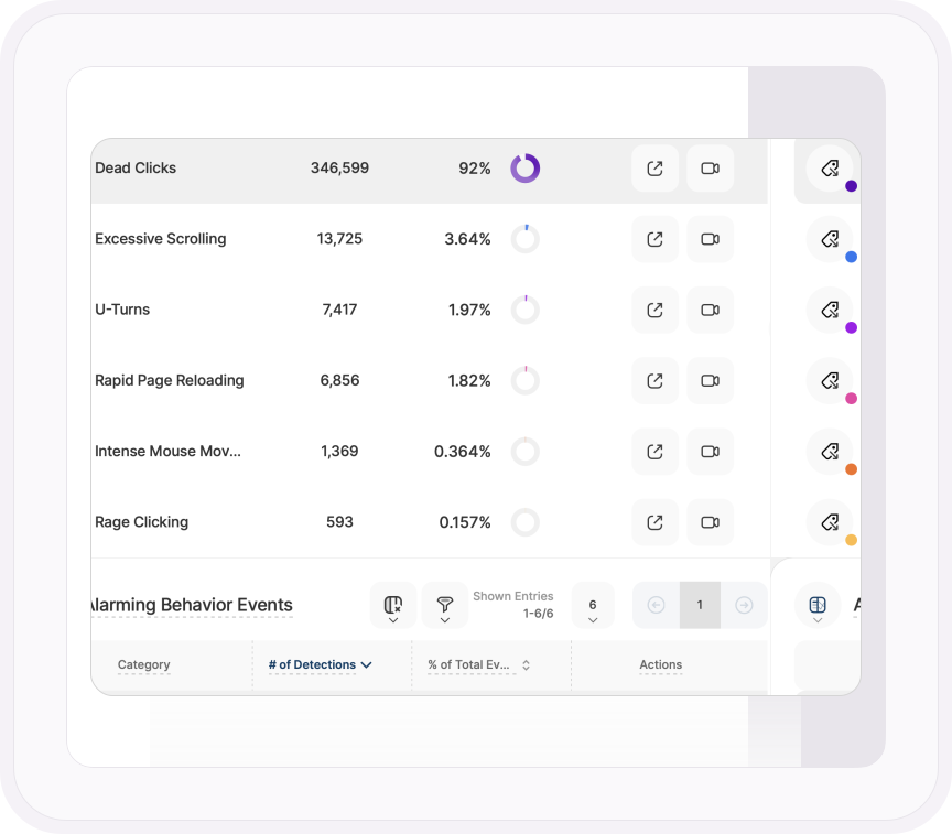
Nobody fills in a feedback form to say the button didn't work. They click it again. Then again. Then they leave. TWIPLA watches for the six behaviors that mean frustration and counts every one automatically, with nothing to set up and nothing deducted from your event budget.
- Dead clicks: something looked clickable and nothing happened
- Rage clicks: the same thing hammered over and over within seconds
- U-turns: a page opened and abandoned within seconds for the one before it
- Rapid page reloading: the same page refreshed again and again
- Excessive scrolling: hunting up and down for something that isn't where it should be
- Intense mouse movement: a cursor darting around a layout that makes no sense
SESSION RECORDINGS
The problem, and then the video of it.
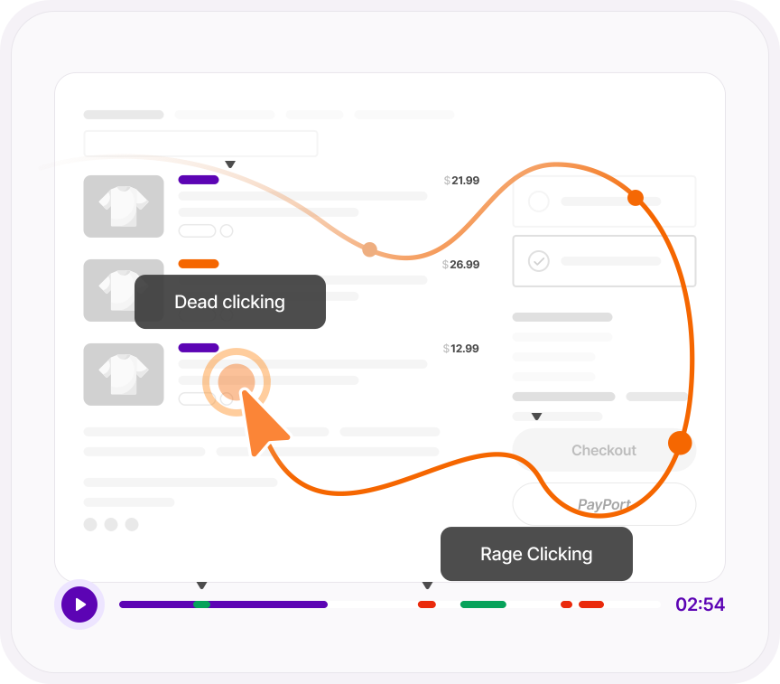
Every signal in the table has a recordings button beside it. Click it and you get the sessions where that frustration happened, with the moment marked on the timeline so you're not scrubbing through a replay hunting for it. Click a spike on the chart and you get the recordings behind the spike. Then see which pages it happened on, where those visitors came from, and when it started.
- Jump from any frustration signal to the session recordings that contain it
- The frustration moment marked on the recording timeline
- A detail view of the pages affected, the referrers that sent the visitors, and first and last occurrence
FRICTION BY PAGE
Find the page that's doing it.
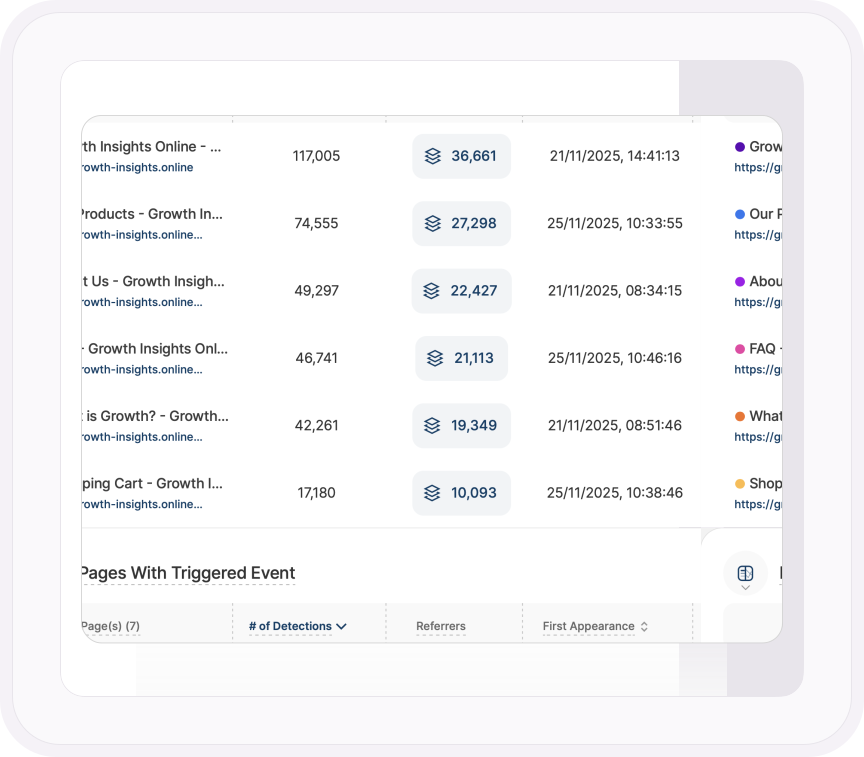
102,000 dead clicks is a symptom. 90,000 of them on one product page is a diagnosis. Open any signal and you get the pages it happened on, ranked, with the referrers that sent those visitors and the first and last time it fired. So you're not fixing "the site." You're fixing the image on the pricing page that everyone thinks is a button.
- Every signal broken down by the pages it happened on
- The referrers that sent the frustrated visitors, and when it first and last occurred
- Track any signal by day, week, month or year, and see the spike the day it happened
- View by count or by share of all signals to see what's really driving the score
Get started freeTalk to a human
ONE PLATFORM, FOUR STAGES
Most analytics show you what happened. TWIPLA walks you to what to do about it.
Every tool runs on the same tracking code, and the filters you set follow you from report to report. So a number on this page becomes a recording, a funnel or an answer in one click. Analyze is where the numbers turn into behavior. Here's the whole route.
- OBSERVE: See what's happening →
- ANALYZE: See how visitors behave YOU ARE HERE
- UNDERSTAND: See what it costs you →
- ACT: See what to do next →
More Analyze tools