





Heatmaps
See the heatmap. Then read the numbers underneath it.
Heatmaps shows you where visitors click, where their cursor lingers and how far they scroll, on one page or every page built like it. Then it gives you the same thing as a table: every element ranked by clicks, scroll depth visitor by visitor, ready to export. A picture for the meeting, numbers for the decision.
ANALYZEHeatmaps is one of five Analyze tools. → Explore them all
CLICK, MOVE & SCROLL
Three maps. One page. Every device.
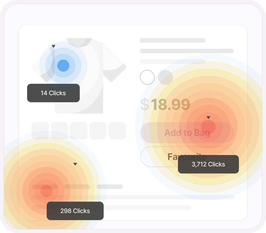
Click maps show where people click, and on mobile and tablet, where they tap. Move maps show where the cursor went, which is a fair proxy for where the eyes went. Scroll maps show how far down the page visitors actually got, and where they gave up. Switch between desktop, tablet and mobile and the same page tells three different stories.
- Click maps on desktop, tap maps on mobile and tablet, move maps, scroll maps
- Desktop, tablet and mobile as separate views, with page view counts for each
- Pick the heatmap color to suit your brand, or the screenshot you're about to put in a deck
- With first-party tracking set up, the map is built from every visitor, not only the ones who clicked Accept
ONE PAGE, OR EVERY PAGE LIKE IT
Fifty product pages. One heatmap.
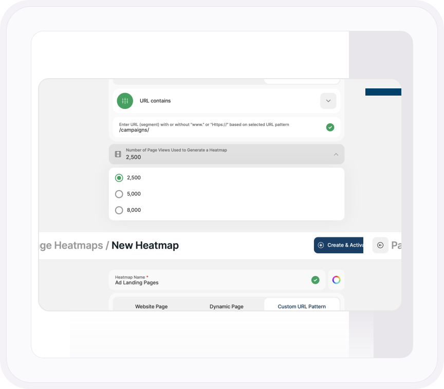
A heatmap of one page is useful. A heatmap of every page built on the same template is a different kind of useful. Dynamic Page pools the data from every product page, article or listing that shares a layout into one map, so you're reading how the template performs, not how one URL performed on a quiet Tuesday. Or define a URL pattern and decide exactly which pages count.
- Website Page for a single URL, Dynamic Page for every page sharing a template, Custom URL Pattern for anything you can describe with starts with, contains, ends with or exact match
- Choose the sample: 2,500, 5,000 or 8,000 page views per heatmap
- Redesign the page and refresh the screenshot without losing the data you've already collected
SHOW ALL DATA
The heatmap, as a spreadsheet.
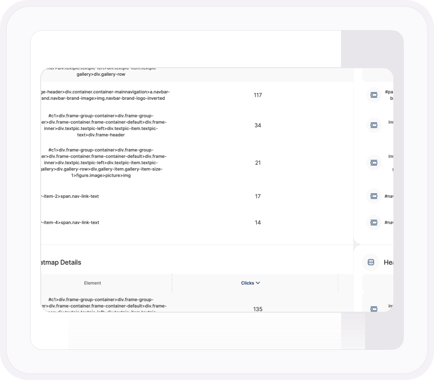
Every heatmap has a table behind it. Click Show All Data and the blobs become a ranked list of elements with the number of clicks on each and its share of the total. Scroll maps become a depth table: how many visitors reached 25% of the page, 50%, 75%, and how many never saw your call to action. Then export it, and the argument for moving the button is a row in a spreadsheet instead of a screenshot with a circle drawn on it.
- Every element on the page ranked by clicks or interaction points, with its percentage of the total
- Scroll depth in steps, with the number and share of visitors who reached each one
- Visitors by country on the same screen, so you know who the map is a map of
- Export the table
ONE PLATFORM, FOUR STAGES
Most analytics show you what happened. TWIPLA walks you to what to do about it.
Every tool runs on the same tracking code, and the filters you set follow you from report to report. So a number on this page becomes a recording, a funnel or an answer in one click. Analyze is where the numbers turn into behavior. Here's the whole route.
- OBSERVE: See what's happening →
- ANALYZE: See how visitors behave YOU ARE HERE
- UNDERSTAND: See what it costs you →
- ACT: See what to do next →
More Analyze tools